


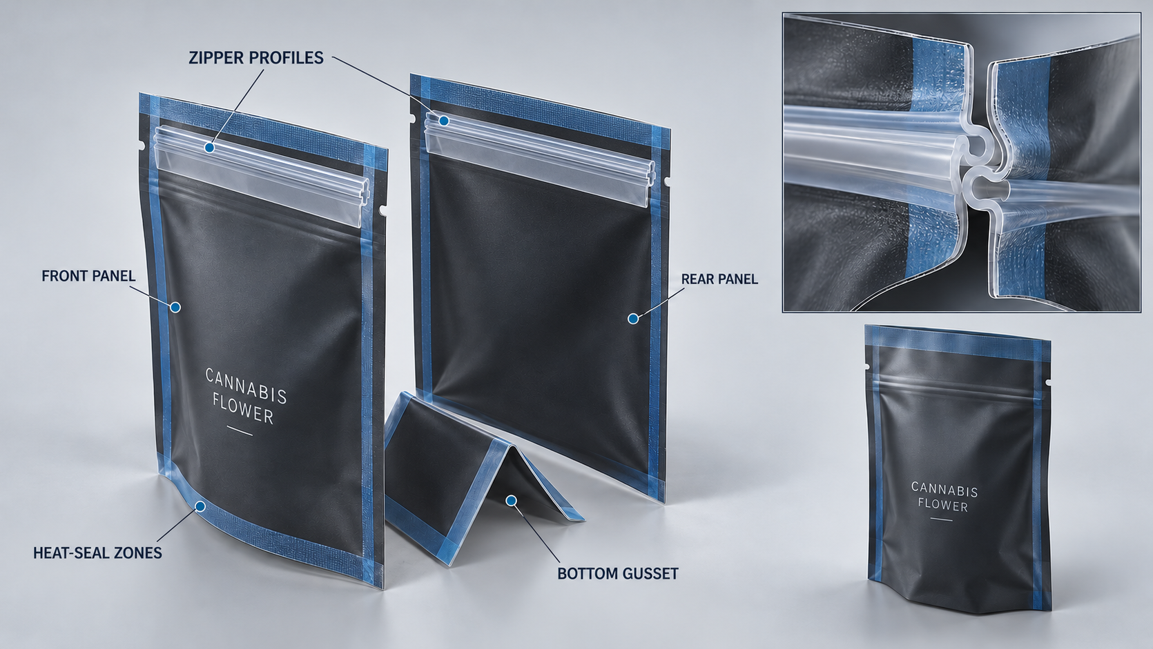
Good cannabis packaging design must work in a multi-shelf moment. It recognizes the brand, segregates the SKU, safeguards the information needed, copies on the package of choice and can be maintained when the portfolio grows all along. A design which works well on one flower pouch may fail when scaled into a pre-roll format or scaled to an edible with increased label text.
The next 12 concepts consider packaging as a mechanism and not a line of sequential graphics. Regulatory needs vary across markets and products and thus each end design requires an updated compliance check-up. The principles steer hierarchy, production and portfolio planning; it is not a substitute of the legal approval.
Instructor: Principle 1: The Portfolio.
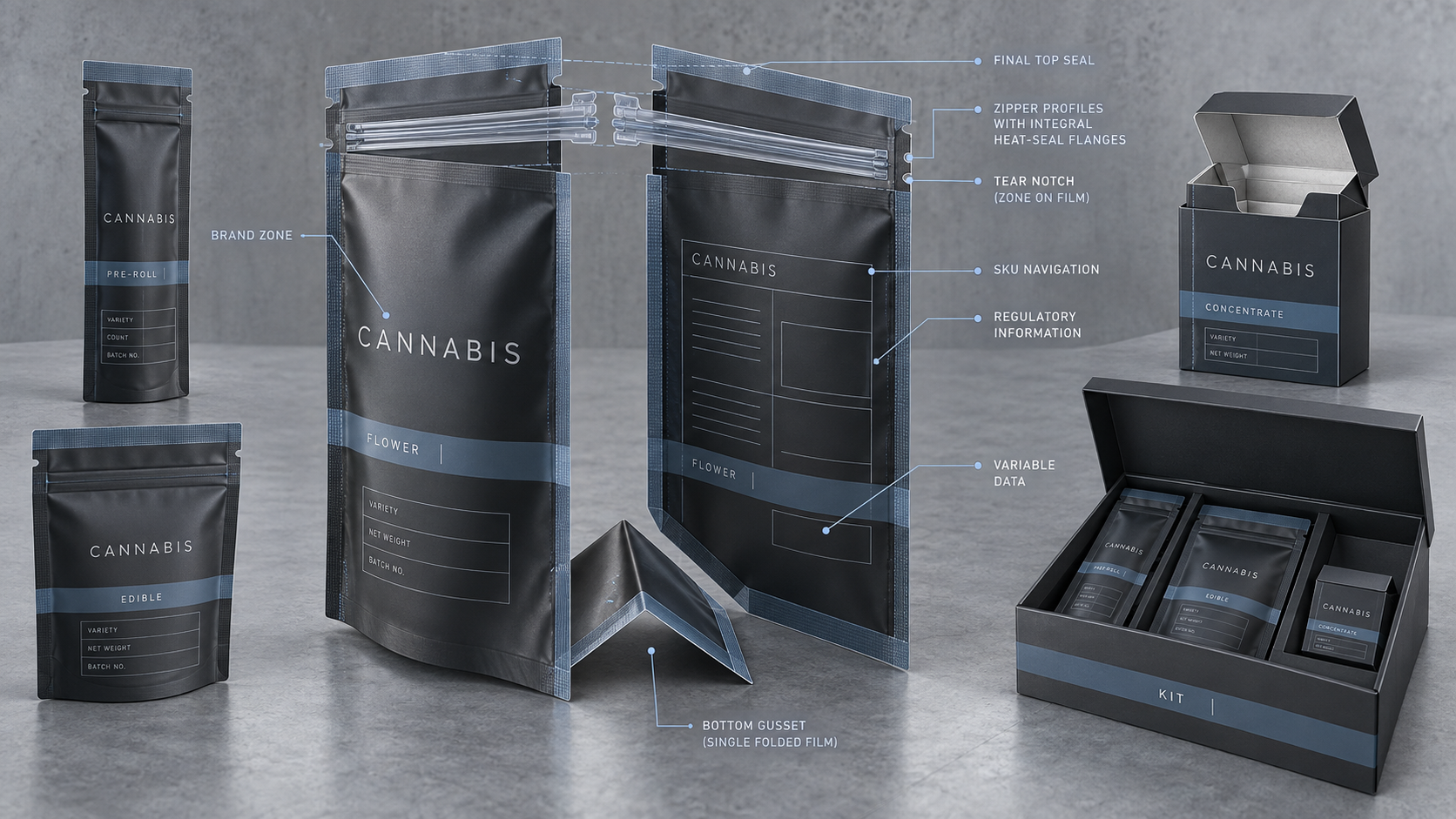
Name the products that the brand sells and what new products the brand will introduce. Group them by format, size, potency or other consumer decision which is lawful. Then determine what has to be the same at all points and what has to vary.
The design system ought to differentiate product navigation and brand recognition. Logo, essential typography and structural rhythm may persist. Form of product, variety, net quantity and content of regulations of a market must vary under control. In case of a change in all the elements the range appears to be irrelevant. Unless something is changed, customers are not able to navigate it.
Principles 1-3: It is time to make the Brand Building.
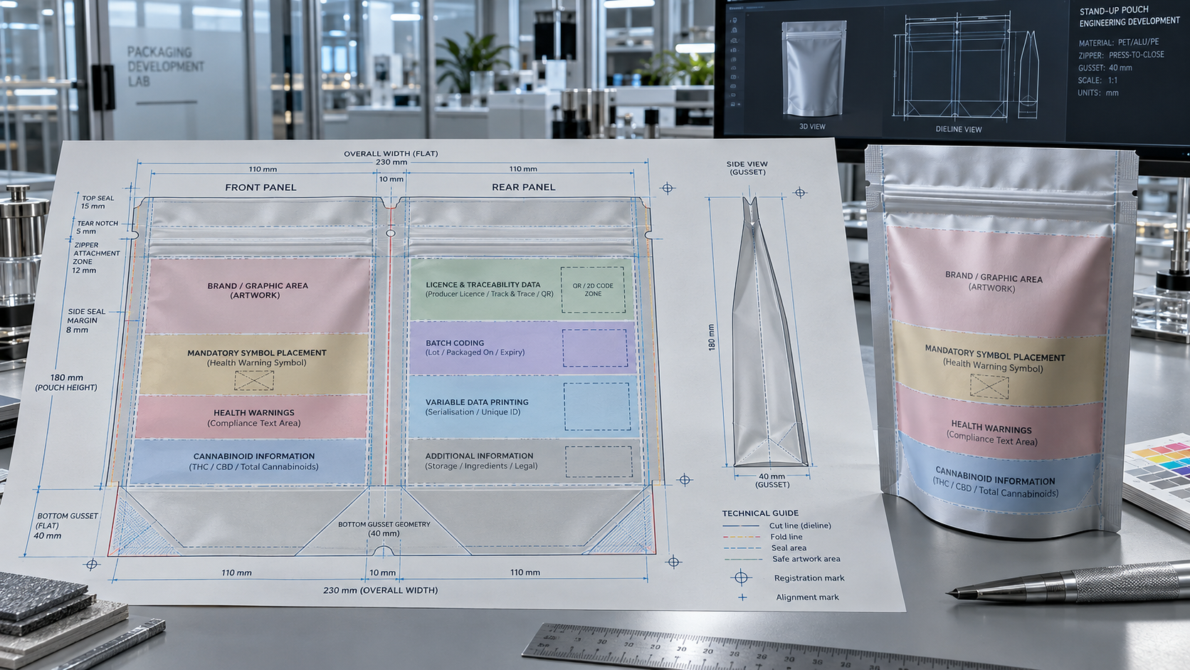
First, Separate Brand Identity and Regulatory content.
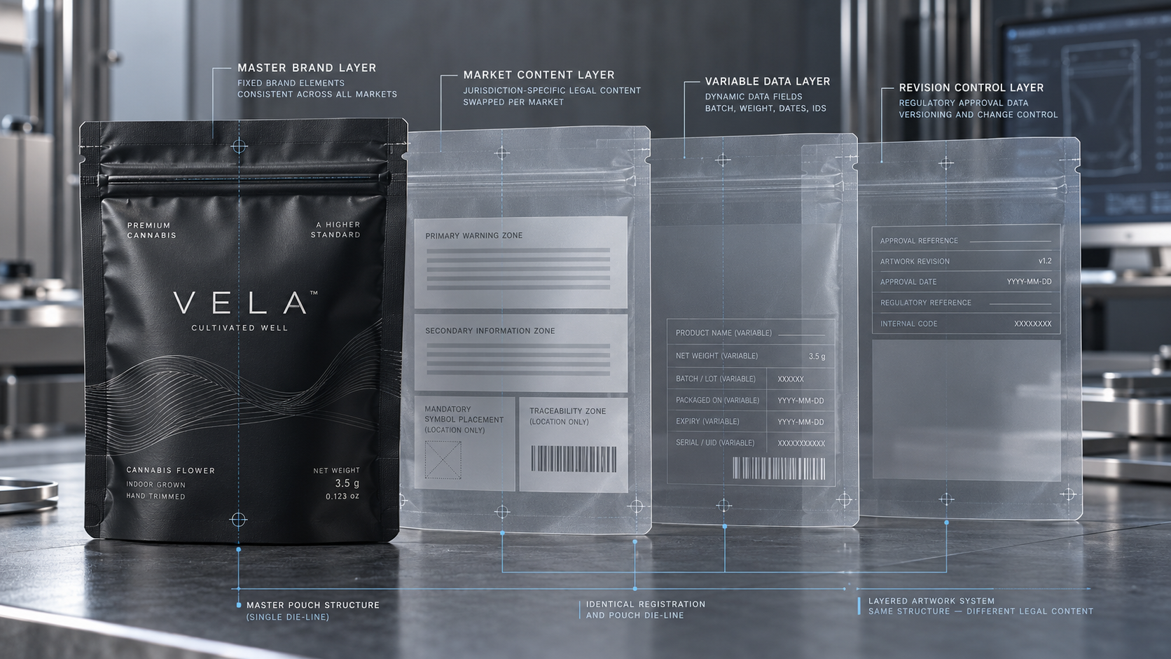
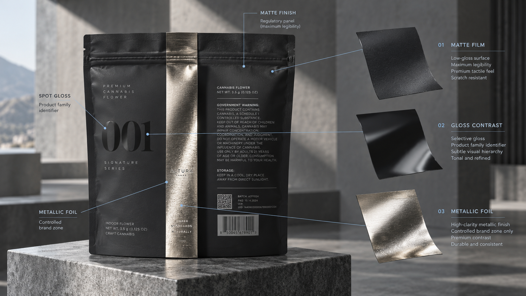
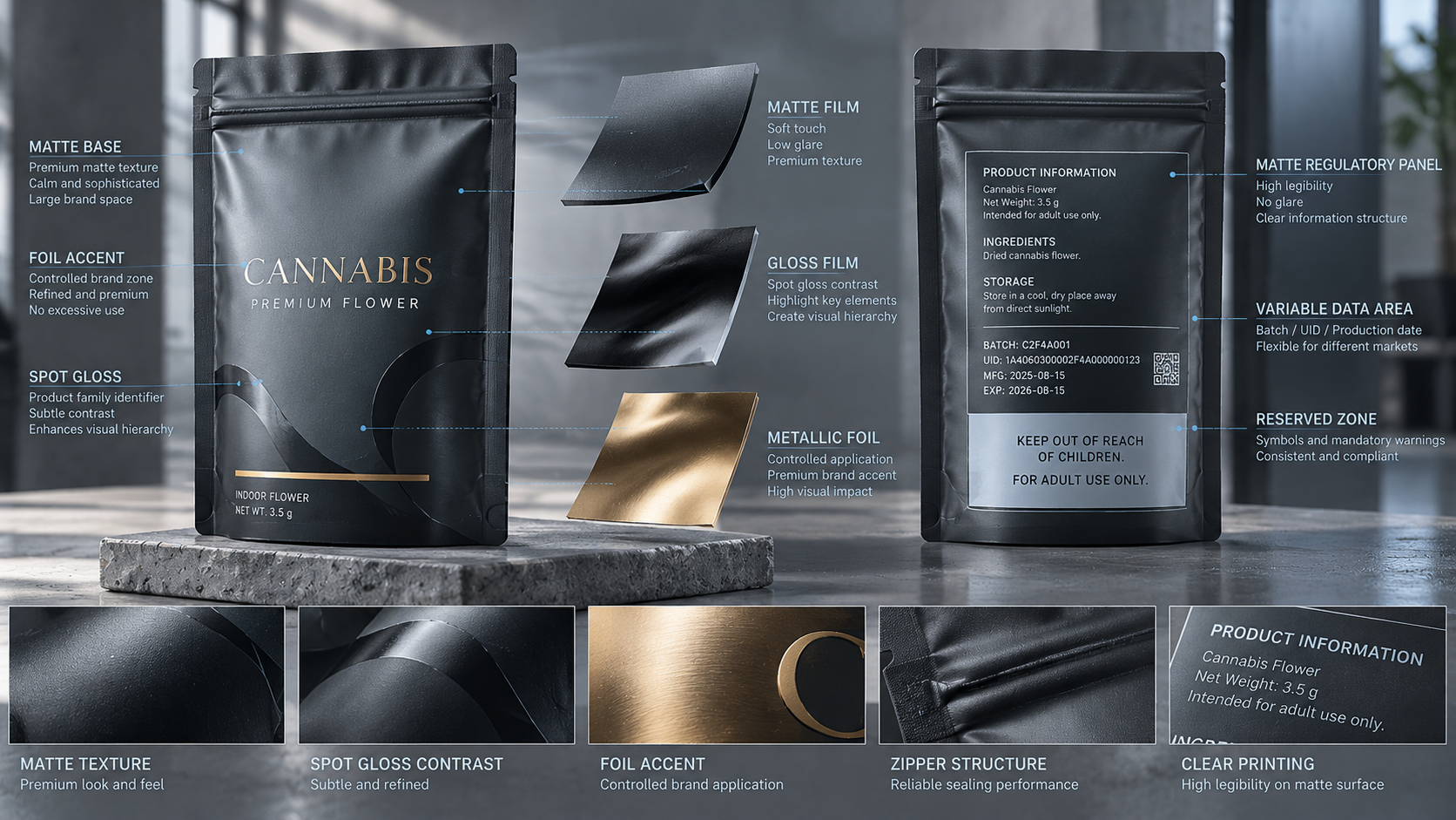
Establish individual areas to the brand and information needed. This ensures that updates to compliance have a lower likelihood of causing harm to recognition and prevents ornamental aspects of objects and warnings from covering symbols. The zones can be on the same plane, though they are not to rely on each other to be legible.
Have a Uniform SKU Hierarchy.
Choose the order of reading: brand, product form, variety, important lawful attribute and amount. Repeat the process on the portfolio. Swap out a single or two cues to navigation like, a colour band or a format name, as opposed to redesigning every SKU completely.
The hierarchy is not to be working in a color scheme but rather on a grayscale and thumbnail basis. This will show us either that colour is overworking or otherwise, and such that the product name loses form when it appears on the internet.
Design without borrowing youth culture Designs that are created but not borrowed by the youth generation.
Unique wrappings do not involve cartoons, imitation of candy or child-enchanted novelty. Develop character using material, typography, composition, restraint and product-related narratives. Test the overall impression, name and package shape, on the youth-appeal taboos of the target market.
Principles 4-6: Be Visible Compliance.
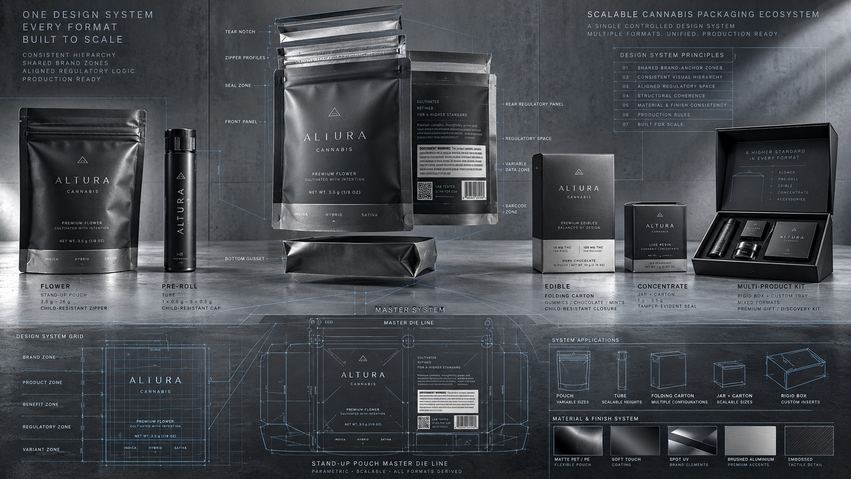
Reserve Regulatory Zones on the 1st Dieline.
Wait not till copy final. Areas of symbols, warnings, cannabinoid data, licence or traceability information and variable coding to be blocked out. Take the challenge of the highest target market as a space-planning situation, and keep the approved artwork variations apart, with rules varied, where the rules are different.
Guard Hierarchy, Distinct and Clear Space.
The information necessary must come off the real substrate, the finish and package form. A warning on a dark photograph, symbol over a foil highlight or text crossing a gusset may not work. Print up to final, package and test in regular retail lighting.
Contain Jurisdictions in Controlled Layers.
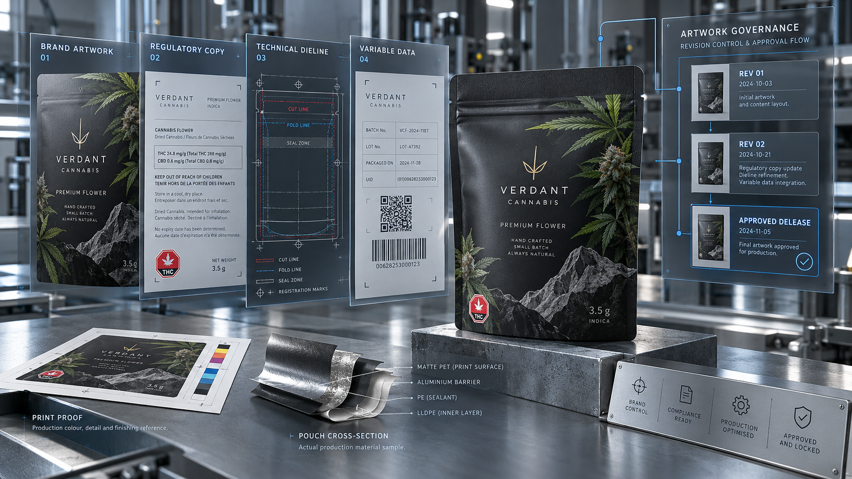
uncouple the legal content of markets to stable brand art. Name versions SKU, jurisdiction, date of revision and approval. Keep authoritative icons and an authorized text that cannot be tweaked at the whim of the designer. prior to each repeat order, ensure that the market layer remains updated.
Principles 7-9: Package and Print to Match.
Have the Format Influence the Composition.
A stand-up pouch will provide another front, gusset and opening route compared to the flat pouch or carton. Put high priority information where the formed pack naturally presents it. Store key copies off seal, tear notches, zipper track and product-hiding areas.
Real Printing Process Design.
There are commercial and artwork concerns that are different in digital, gravure production and flexographic production. Fine reversed lettering, narrow registration, wide metallic spaces and slight gradations must be experimented with the selected process and material. Fix on Pantone or measured colour objectives where standardisation is important and sanction a physical demonstration where it is suitable.
Support, not compete with Finishes.
Surface finishes such as matte, gloss contrast, foil, and feeling, can be used to draw attentive, overfinishing does produce noise, and may lower the clarity of symbols or text. Allot to every finish a role. As an example, the compliance panel is flat with a restrained spot gloss which can recognize the product family.
Principles 10-12: Build on Growth.
design a Colour System With Rules.
State the colour of master brand, format and variety of products. Established contrast conditions and acceptable combinations. A rules-based palette assists new SKUs to fit into the family without aping a rival or turning younger-oriented presentation.
Ensure Templates are not generic, but flexible.
Scalable template has stable anchors and modular adjustments. It must fit a longer product name, more warning text, varying pouch sizes including bi-lingual text where necessary. Test the system using the shortest and longest probable copy prior to approval.
Establish Artwork Governance
Determine the change of brand elements, controlled copy, technical dielines and variable data. One released file, revision log and documented approval. Governance falls under design quality: it will not allow outdated warnings, incorrect zippers and misaligned print parts to get to production.
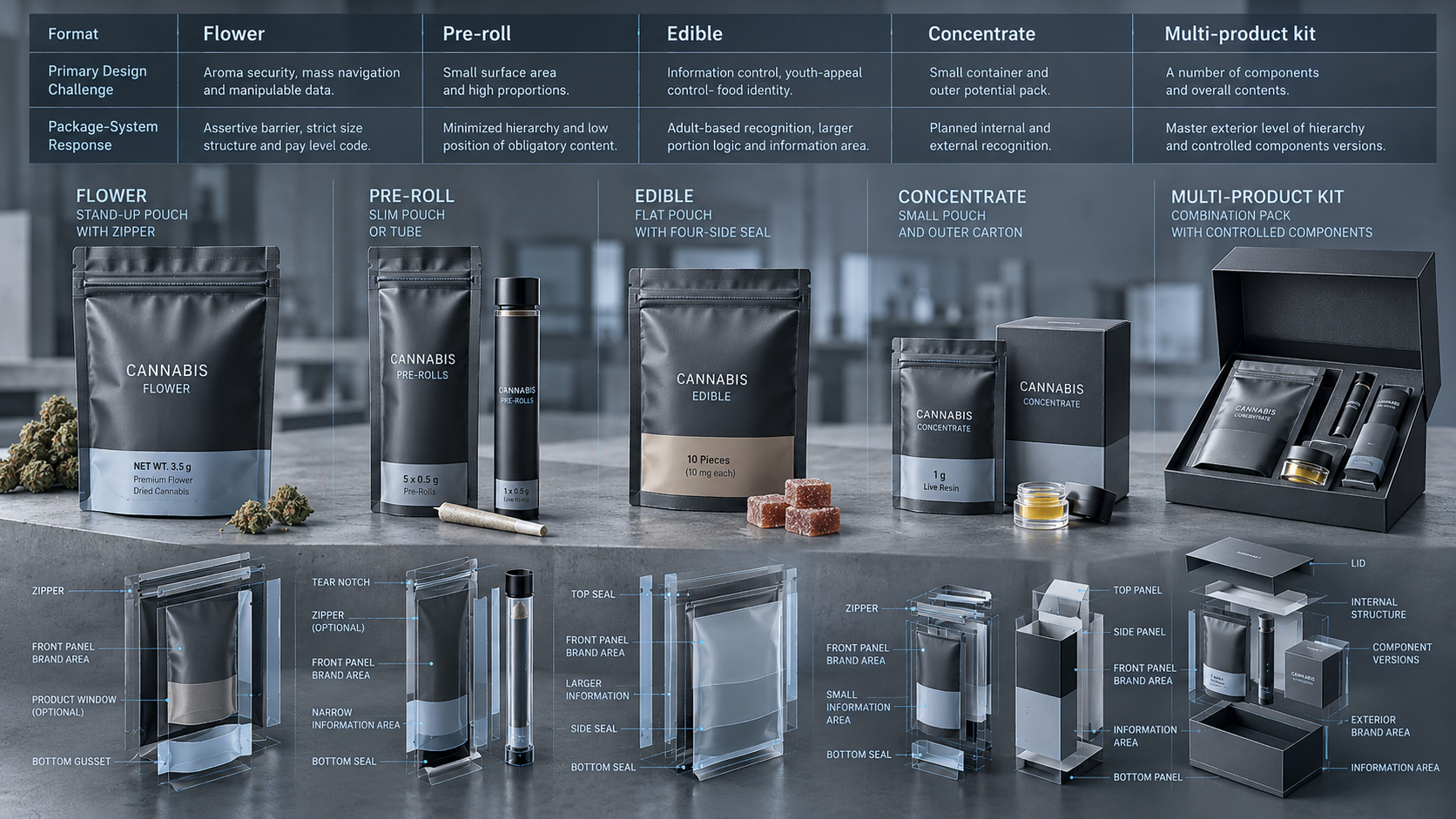
The way the System Varies by the Product Form.
|
Format |
Primary Design Challenge |
Package-System Response |
|
Flower |
Aroma security, mass navigation and manipulable data. |
Assertive barrier, strict size structure and pay level code. |
|
Pre-roll |
Small surface area and high proportions. |
Minimized hierarchy and low position of obligatory content. |
|
Edible |
Information control, youth-appeal control- food identity. |
Adult-based recognition, larger portion logic and information area. |
|
Concentrate |
Small container and outer potential pack. |
Planned internal and external recognition. |
|
Multi-product kit |
A number of components and overall contents. |
Learning: Master exterior level of hierarchy and controlled components versions. |
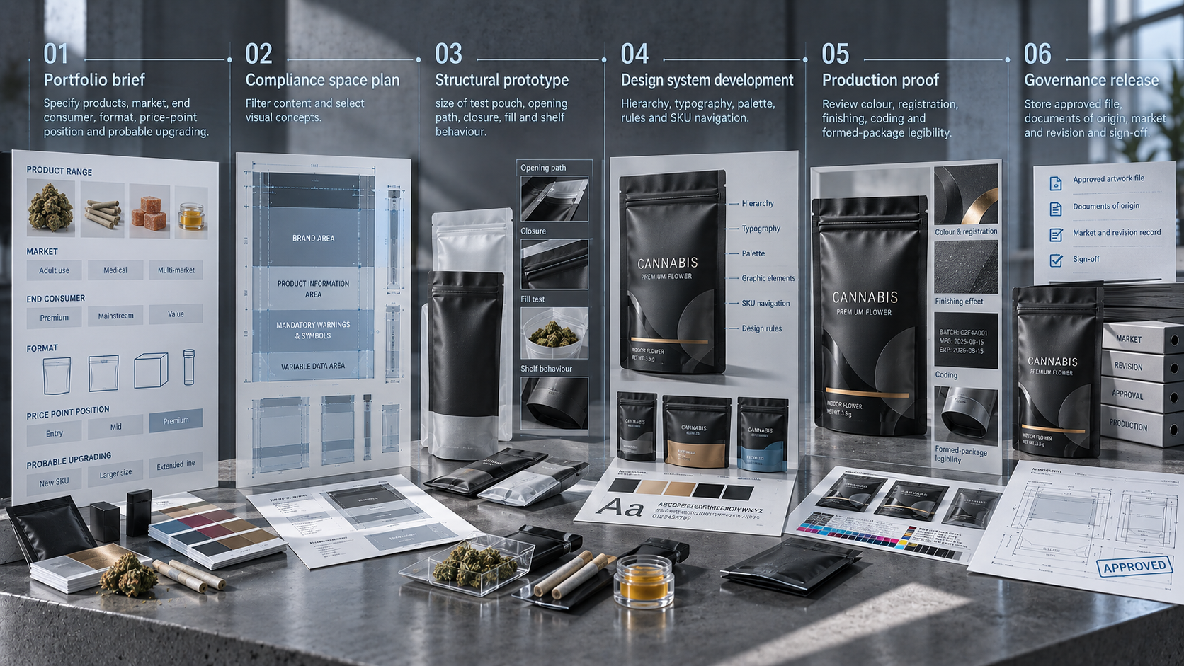
A Cannabis Packaging Design Process.
|
Portfolio brief |
Specify products, market, end consumer, format, price-point position and probable upgrading. |
|
Compliance space plan |
Filter content and select visual concepts. |
|
Structural prototype |
size of test pouch, opening path, closure, fill and shelf behaviour. |
|
Design system development |
Hierarchy, typography, palette, rules and SKU navigation. |
|
Production proof |
Review colour, registration, finishing, coding and formed-package legibility. |
|
Governance release |
Store approved file, documents of origin, market and revision and sign-off. |
The missteps in the design that undermine the brand.
• Producing each SKU as a single product until the shelf appears to be unappealing.
• Only colour as a means to differentiate products.
• Warnings And symbols until the final-artwork round.
• Designing on flat rectangle and not checking the pouch formed.
• Laying down high-quality finishes on all surfaces and absence of hierarchy.
• Sharing a single regulatory panel among states without validation.
• Labeling files as final, rather than having controlled revisions.
Brief Checklist Cannabis Packaging Design.
• Present and future product formats.
• Licensed channels and target markets.
• Official branding property and banned visual space.
• Packages size, fill weight and closure.
• Constant-content and variable-data approach to regulation.
• SKU browsing and colour rationality.
• Priorities on printing process, materials and finish.
• Test plan prototype and filled-package.
• Owners, reviewers and release process of artwork.
Frequently Asked Questions
Is it better to use the same layout for all the cannabis SKUs?
Do not use a rigid ad hoc composition but the same hierarchy and design logic. The system ought to be able to accommodate format and information requirements and yet still be familiar.
When is compliance review to start?
During the brief and dieline stage. Early space planning prevents late redesign and avoids mandatory information being constrained by production.
Will a custom pouch enhance brand uniformity?
Yes. Print system and recurring structural details are a controlled format, which can be used to yield a recognition range on the basis that each SKU would have the correct product and market information.
Construct a Packaging System (Not One More) Artwork File.
Provide your portfolio map, target formats, fill requirements, approved compliance zones and approved brand assets to YPAK. We are able to aid in creating custom pouch designs and print specifications that assist in a continuous cannabis packaging family.
CTA: Create a Cannabis Packaging System
Related page: Explore YPAK Cannabis Bags
Post time: Oct-21-2026


