


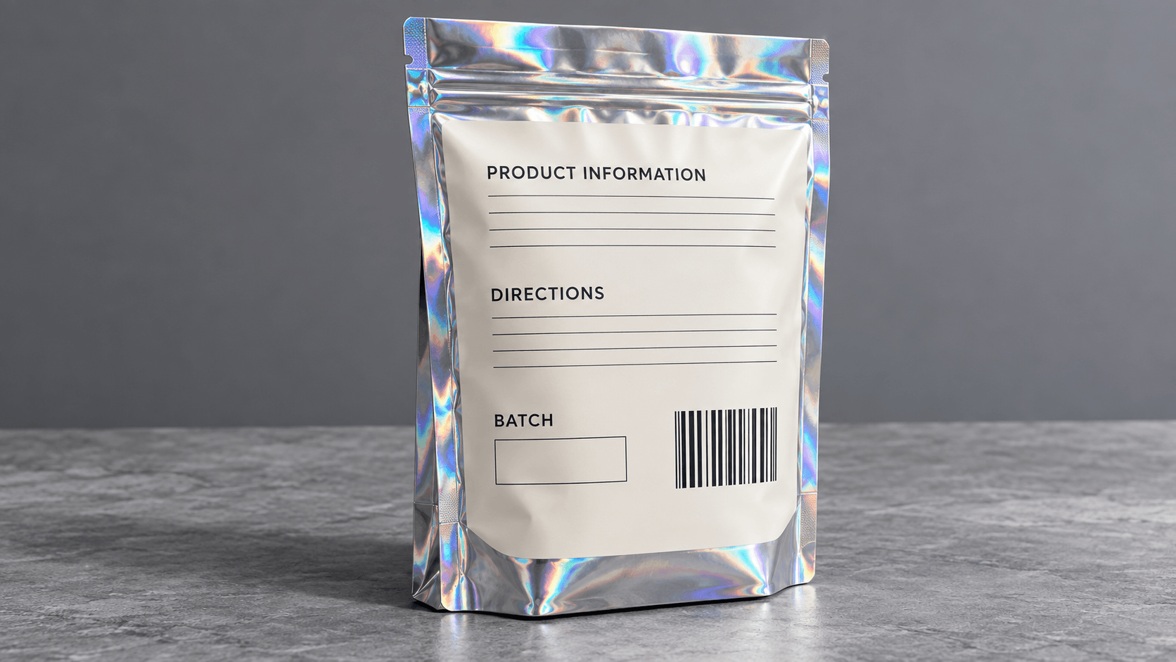
The hologram mylar bags create movement by reflecting and diffracting light using a patterned surface. Neither is it a typical rainbow image topped on white film, which is what makes this happen. It is based on reflective background, white-ink map, colored ink over the white ink and top treatment. Any change in either of those layers will change what is perceived by the customer.
That is why the decision of creating a holographic packaging is rather a production project than a design decision. A permanent mock-up cannot display all the viewing options and a glowing effect can interfere with warnings, product identity or barcodes. The best result is the selective reflections and checking of the actual material.
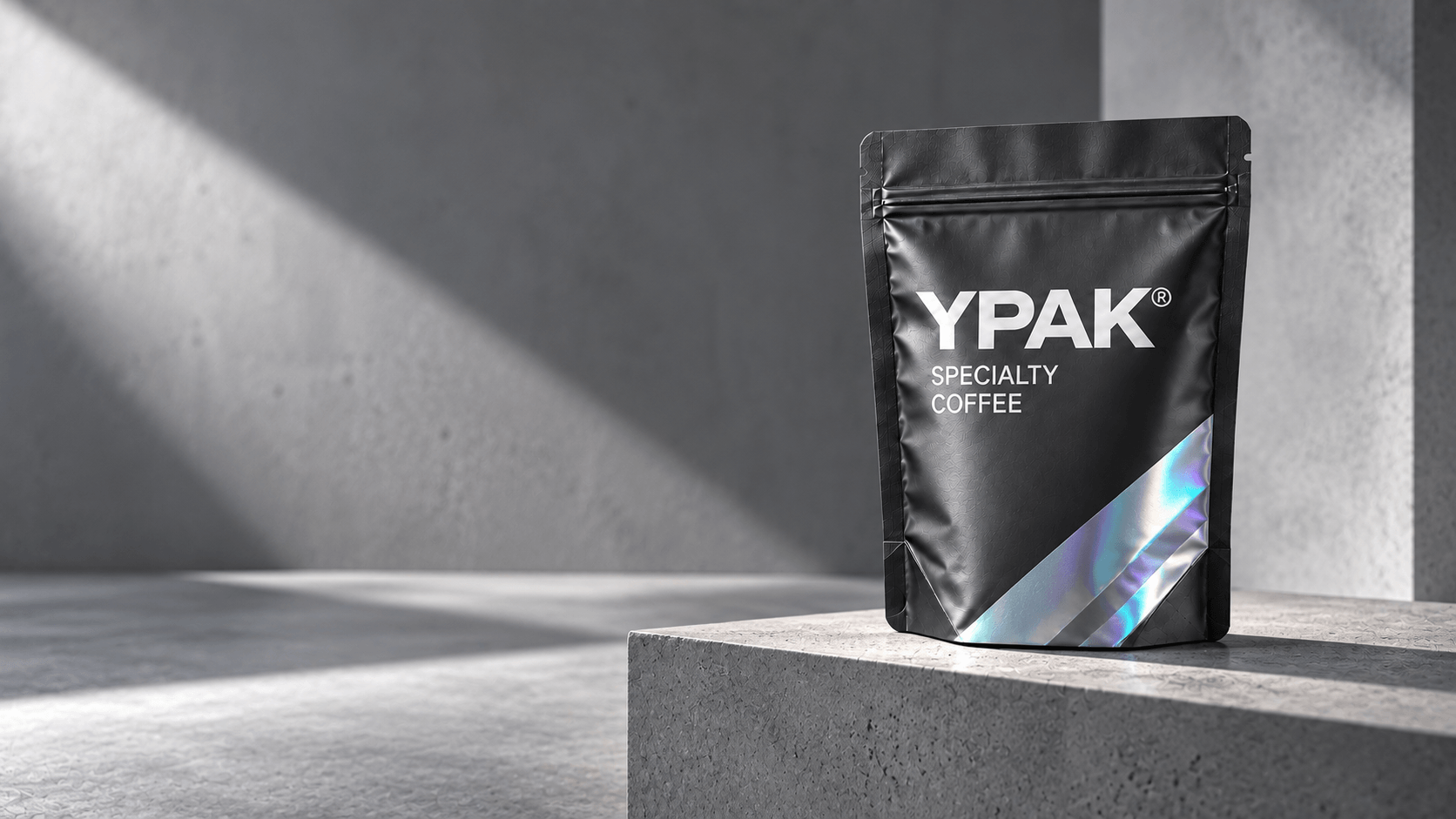
Familiarity with Holographic Layer Stack.
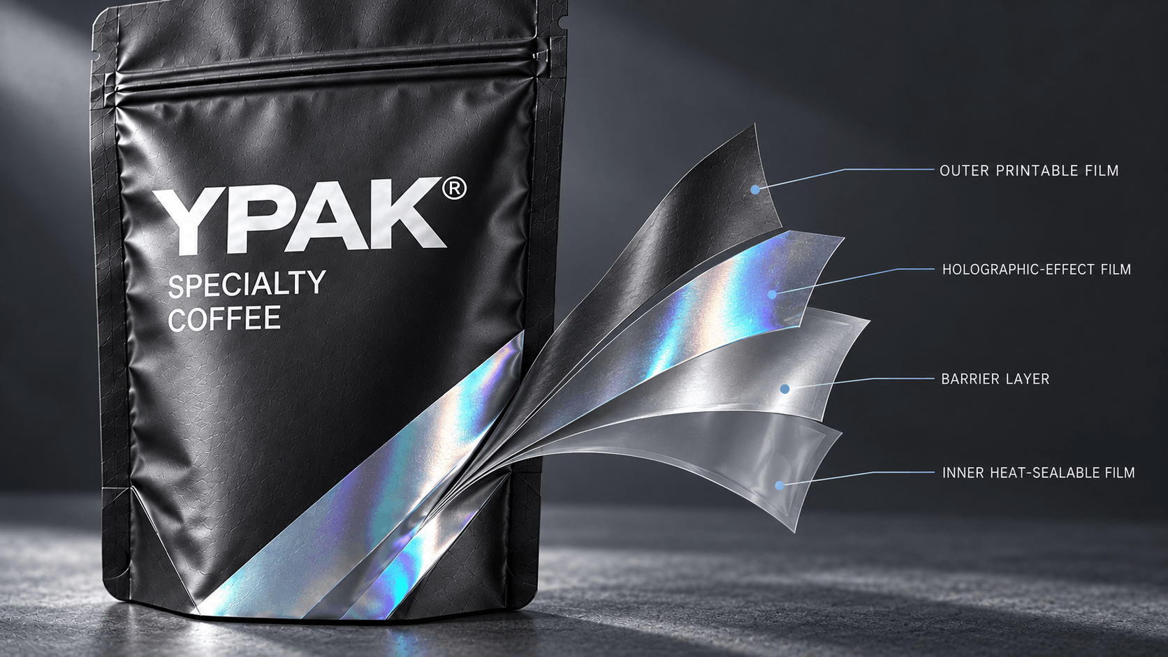
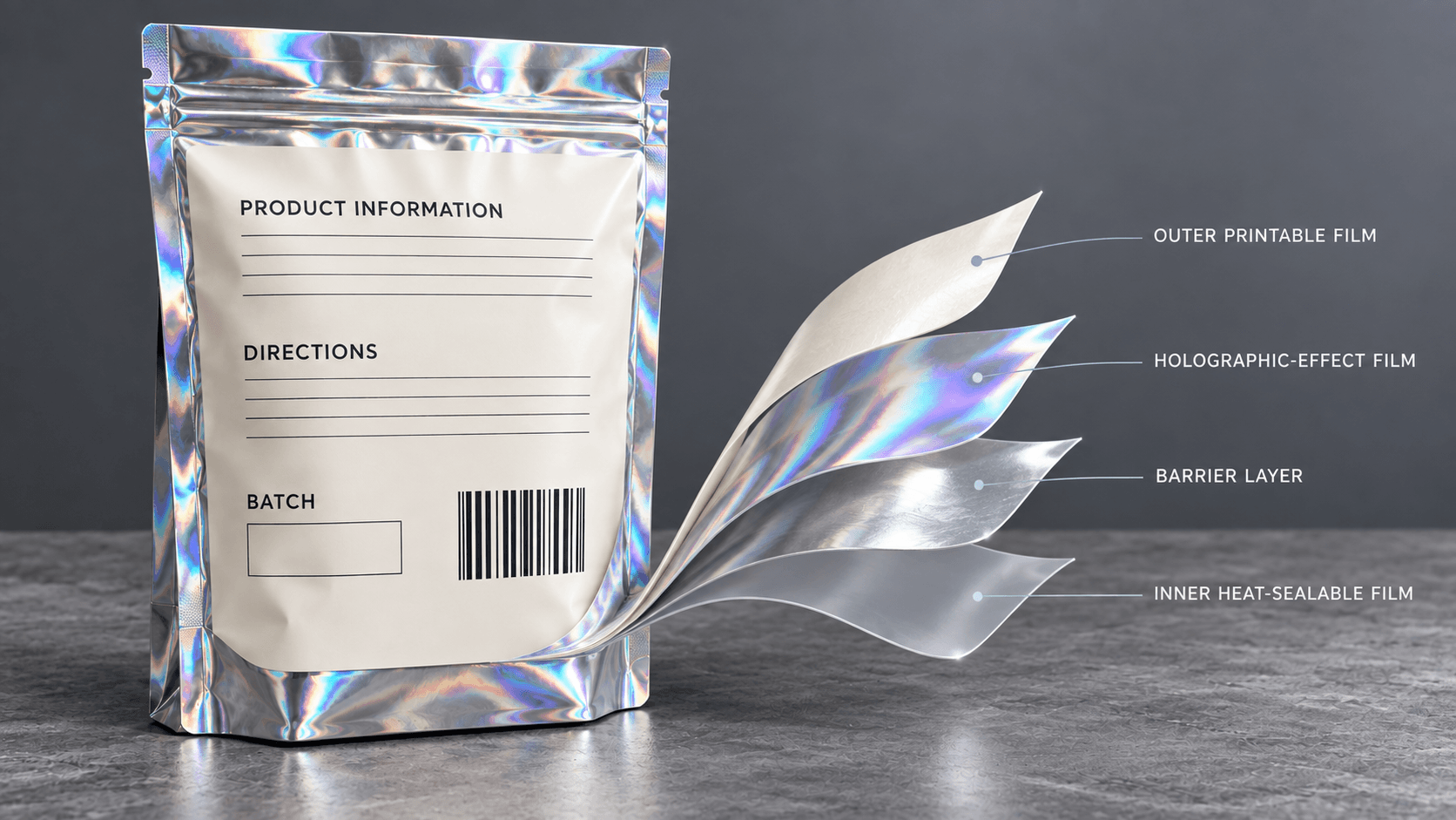
An outer printable layer, holographic or reflective effect, barrier materials and an inner sealant can make a typical holographic pouch. The exact amount expended varies with the product and supplier. Specify the whole construction, suitability of contact of products and other relevant performance information rather than relying on the appearance.
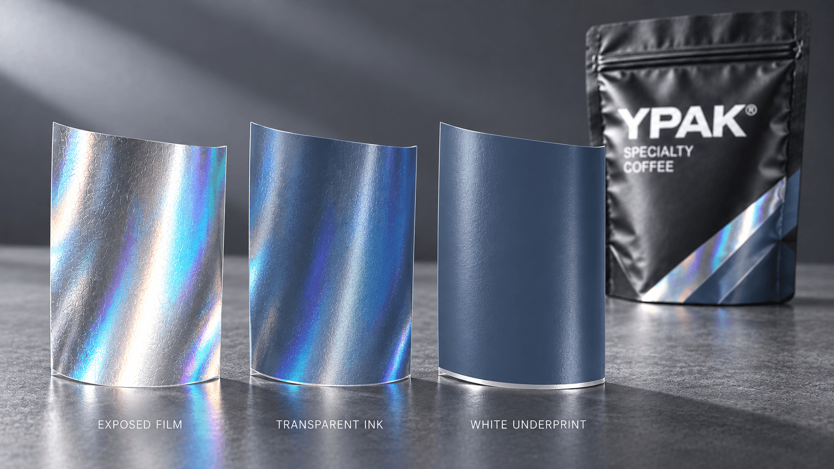
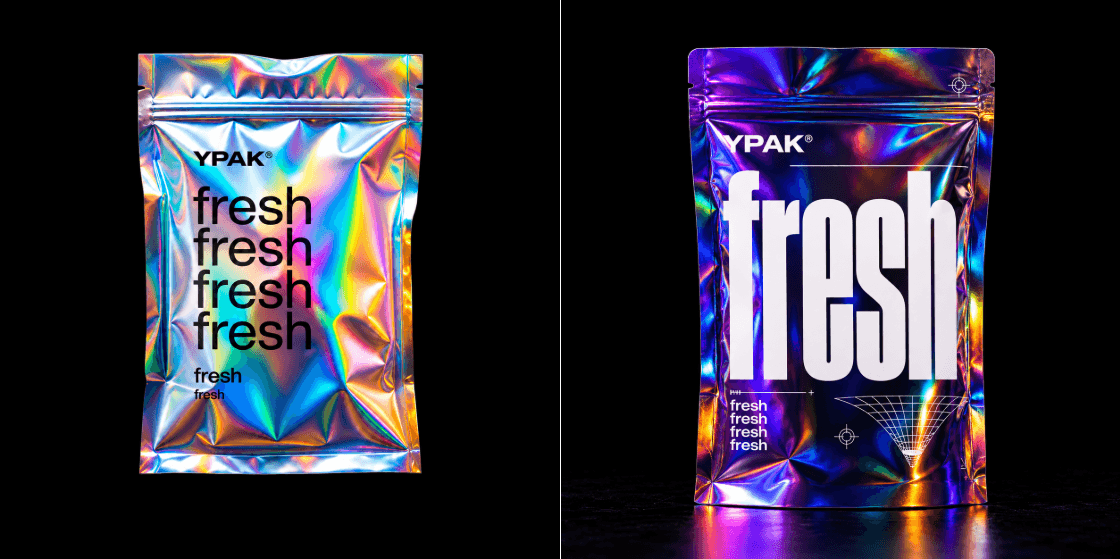
The art work normally engages with the reflective surface in three aspects. Most of the holographic effect can be blocked by an opaque white under-print. No white colored printers can be transparent and reflective. The material is the most strongly revealed by an unprinted knockout. These selections comprise the visual bag vocabulary.
Choose the Intended Light Behavior
Identify the place and the direction of movement of the pouch in the light prior to designing.
Full-surface reflection
This creates the greatest impact although it can result in a visually noisy package. It is used in the best case where the typography and compliance area is overly supported by opaque.
Selective holographic windows
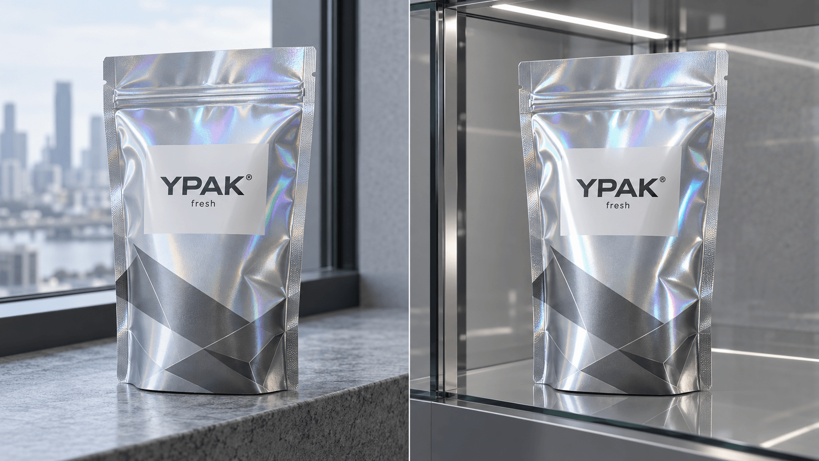
The reflective bottom is displayed in some logos, patterns or accents with most of the pouch being filled using white ink. This introduces control and could make a little effect more high end.
Tinted reflection
The shift of the color on the holographic surface to transparent color without motion is feasible. Ink density and material is essential in the result printed and hence, proofing is needed.
Matte-holographic contrast
Flat surfaces have the ability to soothe large spaces and the chosen gloss or uncovered holographic spaces to reflect. This way renders it hierarchical without turning the whole pouch a mirror.
White Ink Determines what to keep in sight.
The layer of design should be white ink rather than a setting on a printer. Prepare a different plate or channel which is distinctly labeled depending on the requirements of the supplier. Map full-opacity areas of small text, controlled information, barcodes and colors which require a fixed look.
Place controlled knockouts on holographic film location. Do not have an unintentional gap in type or logos. Even very fine transitions may be difficult to register, and ask the supplier what trapping is like, and what the smallest feature size is.
To demonstrate the artwork, an effective evidence proves it in three forms, color art, white-ink map and combined outcome. This simplifies the process of the brand, designer and prepress team to reach consensus on what the effect should be.
Plan Color on Reflective Surface.
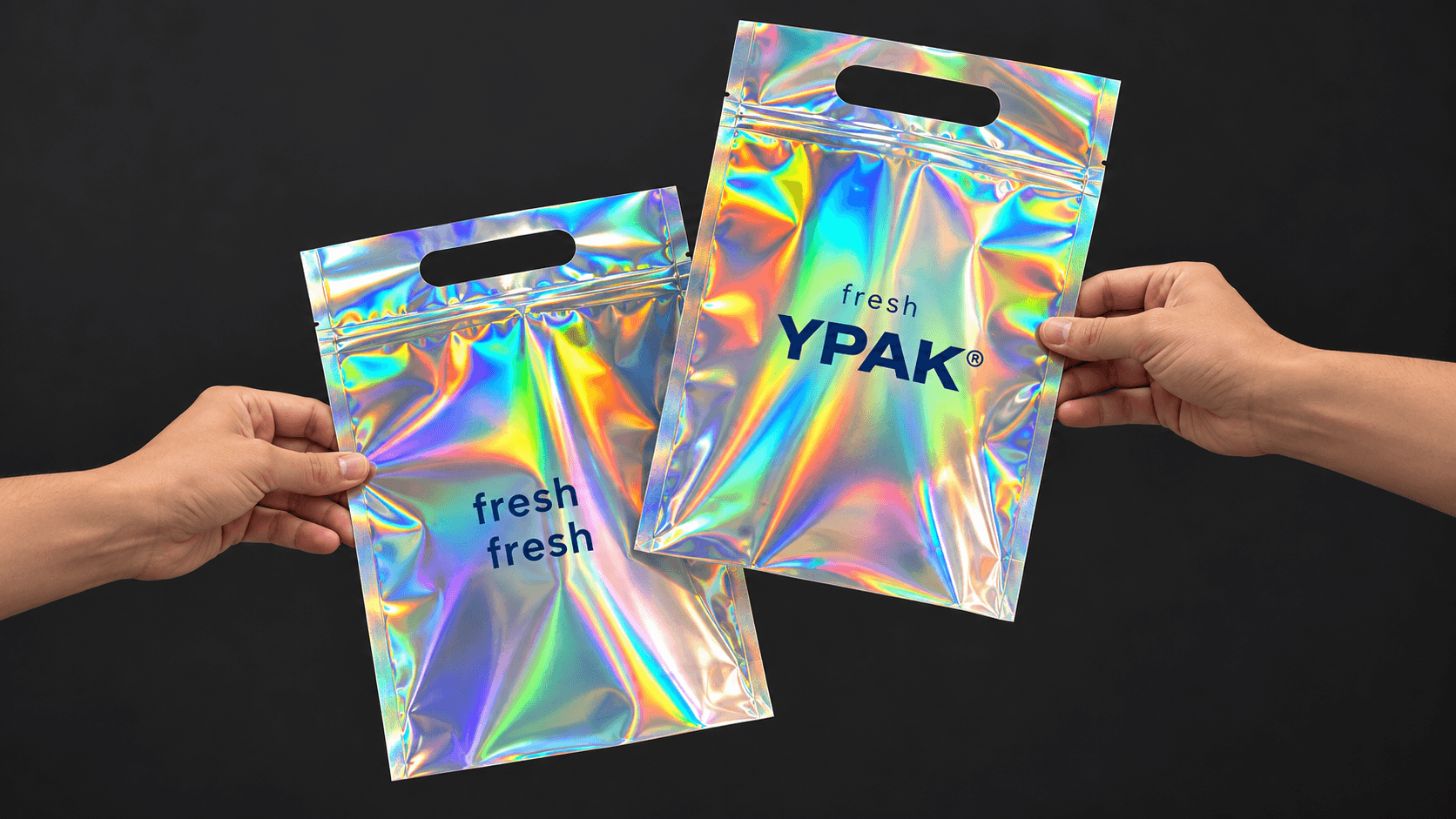
The values of color selected to be applied on the white paper do not provide any clue to the holographic result. Clarity inks can be seen to be brighter on a head-on light and duller in an oblique reflection. Gray neutral is able to capture rainbow shifts. Thick black ink can quash reflections, but still can act differently than a white-backed field.
Develop a mini-palette of colors and assign colors a strategy of opaqueness. Skin tones, photographic and compliance text on a stable base where exact reproduction is of importance. Use a reflective color on what change is a desirable feature of an experience.
Do not accept critical colors of the brand on the Internet. Compare physical samples of daylight, low ambient and retail LEDs. The ink approach and finish approved should be documented to give a reference to reorders.
Make Hierarchy using Matte and Gloss.
Visual activity is already generated by holographic film. It is possible to add foil, gloss, embossing and numerous bright colors simultaneously which can ruin the reading order. Choose one predominant effect and leave other finishes to back it up.
Matte treatment may aid handling, and minimize glare, whereas a gloss window increases reflections. Scuff resistance and code printing, as well as claiming sealing or recyclability can be influenced by coatings, though. Be sure that all the package is outlined and proceed to make marketing statements about the material.
Keep store finishes in locations such that they do not need to be coded in different ways unless the coding process has been tested. An aesthetically pleasing surface can be difficult to write on, or can lower scanner contrast.
Create Silent Areas of information.
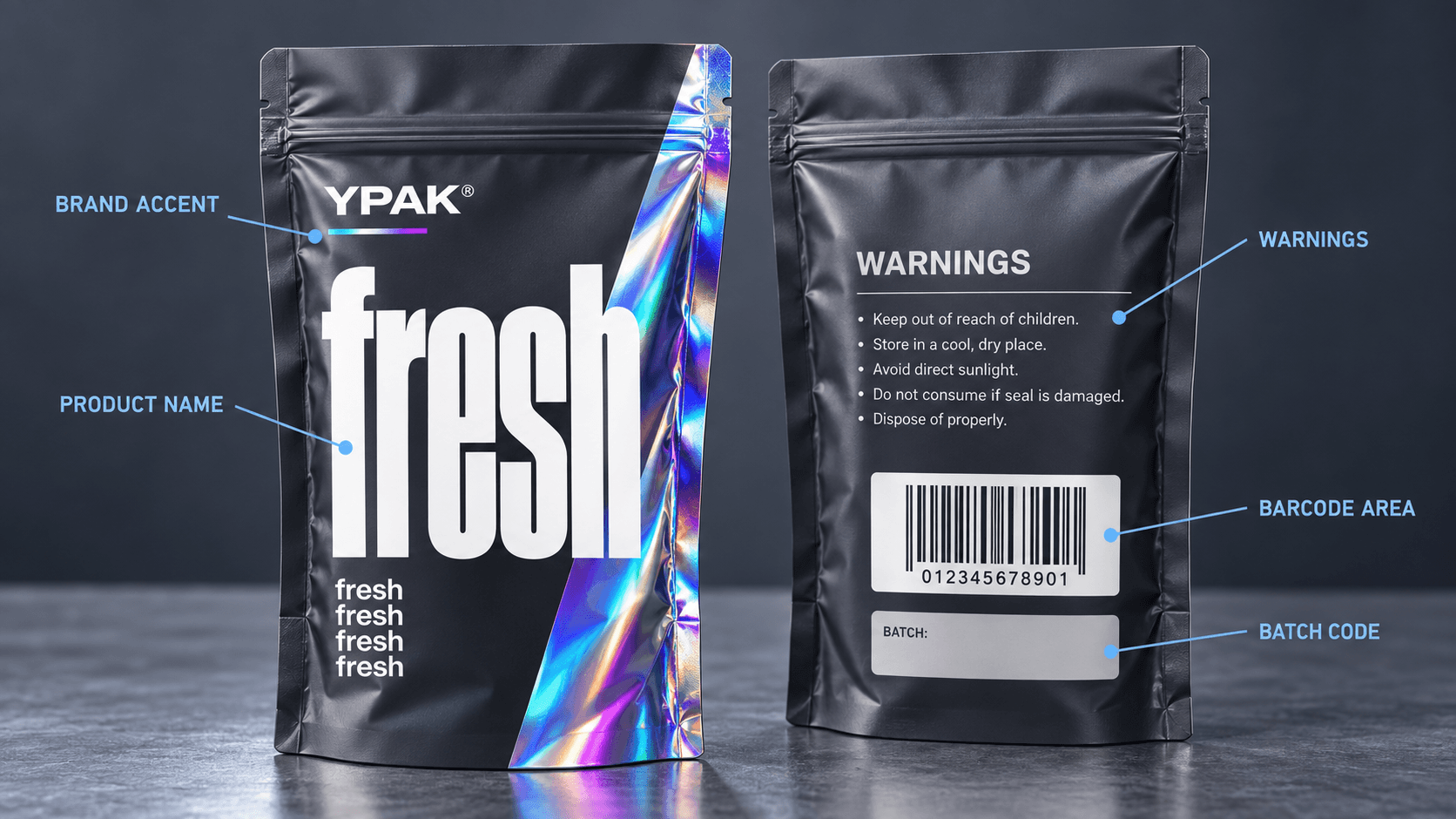
Backgrounds of the necessary warnings, symbols, ingredients, directions, batch data and barcodes should be stable. Have support and space that are non-transparent. Do not apply a QR code over an active pattern of rainbow; the difference between the reflection may cause these modules and background to look less pronounced.
The silent zone does not need to appear distinct of the brand. It can be incorporated in terms of shape and typography and be optically serene. Consider the area on the filled pouch as curvature distortions the reflection.
|
Content Type |
Recommended Visual Treatment |
|
Brand accent |
Selective holographic effect, which is exposed or tinted. |
|
Product name |
High contrast high reflection field. |
|
Required warnings |
Unclear, silent background and authentic type size. |
|
Barcode or QR code |
Dark background. Field stable contrasted print. |
|
Variable batch code |
Coating compatible and reserved area. |
Replacement of Mock-Up to Physical Proof.
Placement but not optical performance can be conveyed through a digital mock-up. Ask the type of sample that will respond to the actual question. The base effect is exhibited in a material swatch. It is possible to test the composition and rough contact with a digitally printed prototype. Final color and registration is better evidence by a production-process proof.
Sample: Fill and form. Turn it around to a variety of sources of light and note where the design is hard to read. Check front/back, seals and gussets. Whether to suspend the bag or to erect it, in either case, the gusset is to be opened to the extent required.
Production Risks and Controls.
Registration movement
Halo can be formed by misalignment of white and color layers. Make fine limits on knockouts as simple as possible and employ suitable trapping.
Scuffing and abrasion
Scratches can be seen on reflective surfaces. Select and experiment exterior finish to expected handling and transportation.
Color inconsistency
Ink density and substrate lots affect the appearance. Ensure that there are accepted physical references and that there are desirable production controls with the supplier.
Unreadable codes
Reflection, coating and curvature may reduce the scan reliability. Test developed pouch real printed codes.
Excessive visual noise
The name of the product and brand can fade away in case of all surfaces being reflective. Grow dark areas or diminish the effect to be seen prior to production.
Approval Checklist Holographic Bags.
Full movie format assured to the product.
Defined holographic areas.
Checked,supply map white-ink.
Color of the brand tested on the real material.
Recorded edges of gloss and matte.
Warnings signs and codes of plain grounds.
Check registration sensitive information checked with prepress.
Lighted filled pouch under different lighting.
Scuff, sealing compatibility and variable-code compatibility tested.
Approved and archived revised sample and artwork.
Frequently Asked Questions
Would the same effect be produced by a normal printed rainbow?
No. A printed gradient can be used to simulate a holographic surface to produce the colors of a rainbow, but not the optical effects of changing color.
Removes the holographic effect by white ink?
It can be significantly blocked by an opaque white layer. This is determined by the coverage, ink transparency and construction and thus should be checked with a sample.
Will holographs be able to work on small text?
Little text ought to be generally placed on a solid, high contrast field. Printing on an active reflection can reduce the readability.
Control Reflection.
Send product specifications, pouch, artwork concept, white ink concept and contrast to YPAK. We will help in transforming the idea into a holograph pouch prototype and sample to be accepted.
CTA: Request a Holographic Pouch Sample
Related page: Explore Custom Packaging Options
Post time: Oct-15-2026


