


Why Is Specialty Coffee Paying More Attention to Packaging Experience?
In the world of specialty coffee, what truly leaves a lasting impression has never been just the flavor itself.
It comes from the climate and soil of a specific origin, but also from a brand’s dedication to detail. From the coffee tree to the final cup, every step is treated with care. Señor Titi’s Coffee from Colombia is exactly this kind of brand — one that closely connects coffee culture, origin stories, and sensory experience.
Señor Titi’s Coffee: Bringing Colombian Origin Flavors to Consumers
The core of Señor Titi’s Coffee has always revolved around Colombian specialty coffee.
As one of the world’s most important specialty coffee origins, Colombia not only offers exceptional natural conditions, but also carries a deep and diverse coffee culture. Señor Titi’s Coffee focuses on single-origin coffees, dedicated to expressing the unique personality and flavor characteristics of the beans themselves.
The brand carefully selects representative coffee varieties such as Castillo Naranjal and Bourbon Rosado. Through precise roasting and flavor management, consumers are able to experience the influence of altitude, climate, and soil in every cup.
“Coffee should not be over-decorated, but clearly expressed.”
For this reason, when Señor Titi’s Coffee began searching for a packaging partner, they were not looking for flashy visual design. Instead, they were seeking a packaging expression that could stay aligned with the spirit of the brand.

Today’s specialty coffee consumers are no longer simply buying “coffee.”
They are also buying:
- Brand aesthetics
- Lifestyle
- User experience
- Social media visual appeal
- Unboxing and tactile experience
As a result, packaging is gradually evolving from a “functional container” into part of the brand experience itself.
For Señor Titi’s Coffee, packaging is not only about protecting coffee. It also needs to communicate the brand’s sense of restraint, texture, and professionalism through both visual and tactile experiences.
Why Are More Coffee Brands Focusing on Packaging Texture?
Señor Titi’s Coffee × ypak: Turning Packaging Into an Extension of Coffee Culture
In this collaboration, Señor Titi’s Coffee partnered with ypak to make packaging an extension of coffee culture rather than simply an outer container.
ypak has long specialized in specialty coffee packaging and consistently believes that:
“Structure, materials, and craftsmanship are equally important.”
For specialty coffee brands, packaging must not only look visually appealing, but also reliably protect coffee flavor during long-term transportation, display, and storage.

Why Is Matte Aluminum Coffee Packaging Becoming a Trend in Specialty Coffee?
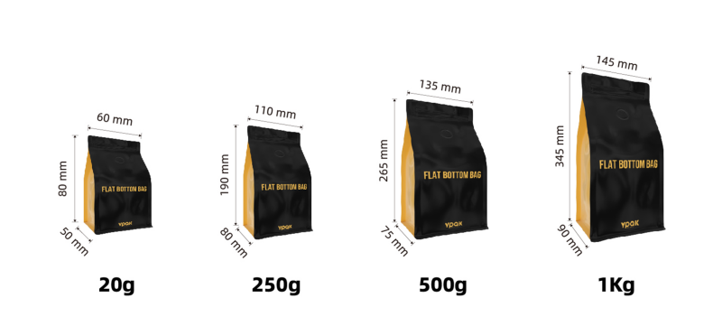
The flat bottom coffee bags used by Señor Titi’s Coffee feature a pure aluminum structure combined with matte metallic printing and tactile film finishing.
This packaging structure not only enhances the premium visual appearance of the bag, but also strengthens coffee freshness protection.
1. Pure Aluminum Structure Provides More Stable Barrier Performance
Pure aluminum structures effectively block:
- Air
- Moisture
- Light
This helps coffee beans maintain freshness and stability under different environmental conditions.
For specialty coffee, stable barrier performance also means flavor can be preserved more completely.
2. Matte Metallic Printing Creates a More Premium Brand Appearance
Compared to glossy packaging, matte metallic printing creates a more restrained, understated, and timeless visual texture.
This material language also aligns with the growing trends in specialty coffee packaging, including:
- Minimalist aesthetics
- Lifestyle-oriented branding
- Nordic-inspired visual styles
- Premium material expression
The packaging does not overpower the product, but instead makes the brand identity feel clearer and more refined.


3. Tactile Film Makes the “Moment of Picking Up the Package” More Memorable
Tactile film is not only a visual finishing technique, but also part of the consumer experience.
When consumers physically hold the packaging, touch directly influences their first impression of the brand.
A soft, smooth, and refined tactile surface makes the packaging feel more premium and helps build stronger trust in the brand.
This is often one of the details many specialty coffee brands overlook.
Why Did Señor Titi’s Coffee Also Choose Three-Side Seal Coffee Packaging?

In addition to flat bottom bags, Señor Titi’s Coffee also uses three-side seal coffee packaging for different product lines and retail scenarios.
This packaging uses matte metallized material combined with tactile film surface finishing.
Compared to flat bottom bags, three-side seal packaging is more flexible and suitable for:
- Hanging retail displays
- Gift box combinations
- Single-serve coffee products
- Small-size coffee products
Although the packaging structures are different, the consistent matte visual finish and tactile surface treatment keep the entire brand system visually and physically unified.
This is also one of the reasons why more specialty coffee brands are beginning to focus on creating a complete packaging system.
Packaging Is Not Only Protection — It Is Also Brand Expression

For Señor Titi’s Coffee, packaging should never overshadow the coffee itself. Instead, it should quietly support the value of the brand.
What ypak provides is not only packaging production, but also support across:
- Material structures
- Printing presentation
- Tactile control
- Brand consistency
These elements together become part of the overall brand experience.
For today’s specialty coffee industry, where more brands emphasize culture and lifestyle expression, packaging is no longer just an “outer layer.”
It has become part of how consumers understand and remember a brand.
How Does ypak Help Specialty Coffee Brands Build a More Complete Packaging Experience?
ypak continues to collaborate with specialty coffee brands worldwide, offering practical packaging solutions through material selection, printing craftsmanship, and tactile finishing details for brands at different stages and positioning levels.
Whether it is:
- High-barrier coffee packaging
- Matte aluminum coffee packaging
- Flat bottom coffee bags
- Small-batch digital printing
- Premium tactile finishing
- Sustainable packaging solutions
ypak aims to help brands discover packaging expressions that better match their positioning.
Because in specialty coffee, packaging not only affects shelf presence.
It also affects how consumers remember your brand.
Frequently Asked Questions (FAQ)
Matte aluminum coffee packaging is a type of coffee packaging that combines aluminum barrier structures with matte surface finishing. It helps protect coffee freshness while creating a more premium, restrained, and specialty-focused visual appearance.
Compared to glossy packaging, matte packaging better communicates premium aesthetics, minimalism, and lifestyle-oriented branding. Matte surfaces also appear softer and more refined in social media visuals.
Aluminum packaging provides strong barrier performance against air, moisture, and light, helping coffee beans maintain freshness, aroma, and flavor stability.
Flat bottom coffee bags provide stronger shelf presence, better structural stability, and larger branding areas, making them increasingly popular among specialty coffee brands.
Consumers experience packaging not only visually, but also physically through touch.
When consumers pick up a package, the softness, smoothness, and texture of the surface directly influence their perception of the brand’s quality and premium feel.
Post time: May-12-2026


