


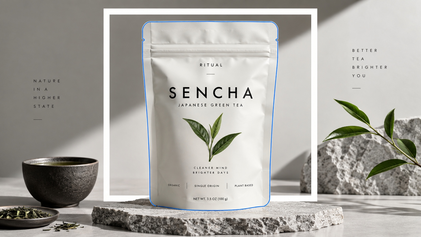
Principles 1-3: Win Recognition Before Adding Detail
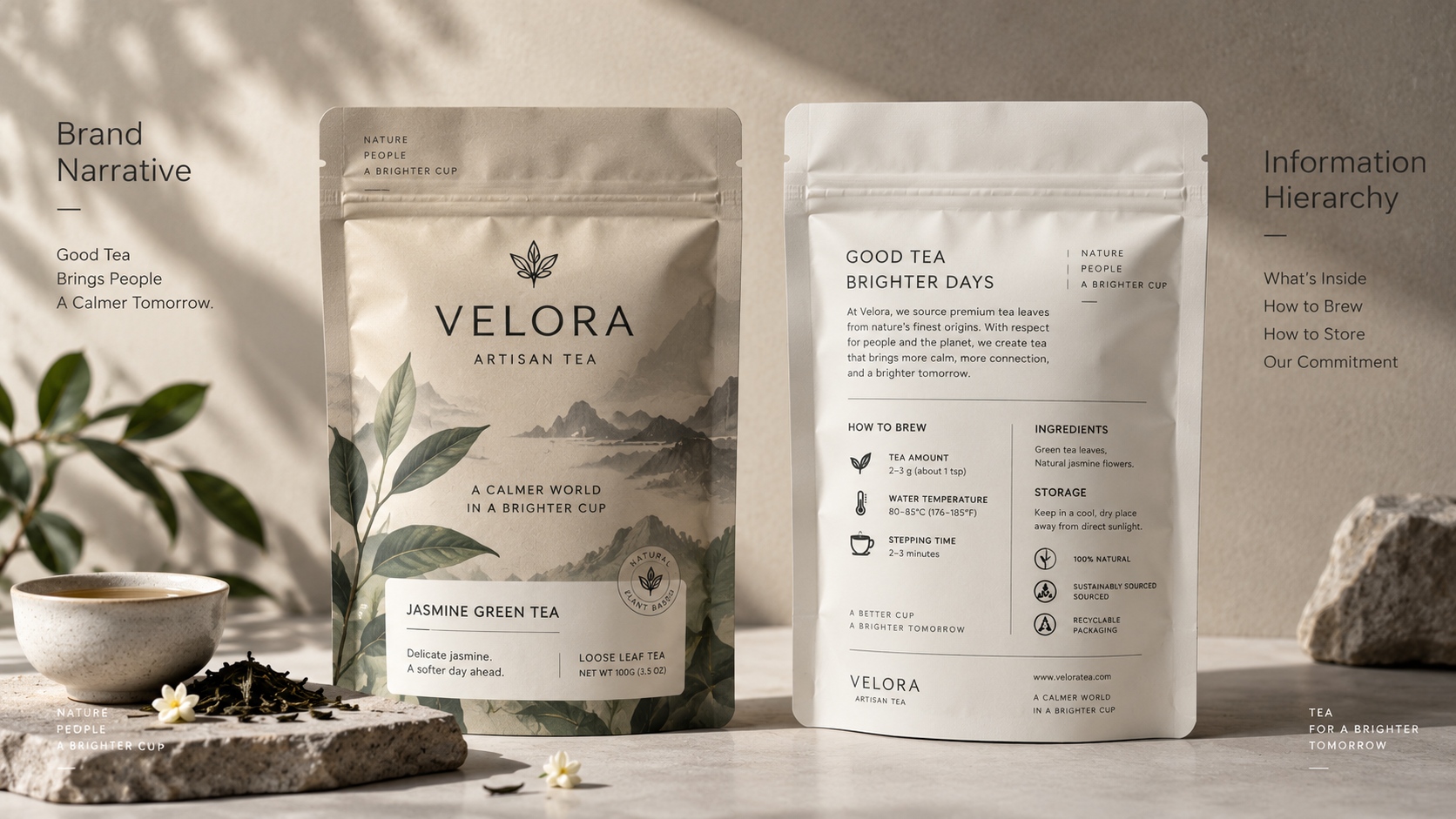
1. Create a familiar Brand block. Provide the master brand with repetition space, size and proportion to the product name. A logo, unique colour field or typographic behaviour may be part of the block, however, it must still be recognizable when SKU colours are altered.
2. Have a Single Visual Priority. Decide which details should be seen first by the shopper: brand name, type of tea, flavour, origin or use. When all messages are equally visualized, the front panel will be slower to comprehend.
3. Distinct Tea Type and Flavour/Variant. Divide category and variant labels into separate tasks. One should not mix up matcha with the taste of mint, or black tea with a collection name of the product. Position, type scale and colour should be used regularly.
Principles 4-5: Keep it Simple: The Product.
4. Provide the Product Format. Indicate that the pack includes loose or powder leaves or tea bags, a mix or a refill. This can be supported by photography and illustration though that should not take the place of an explicit product description.
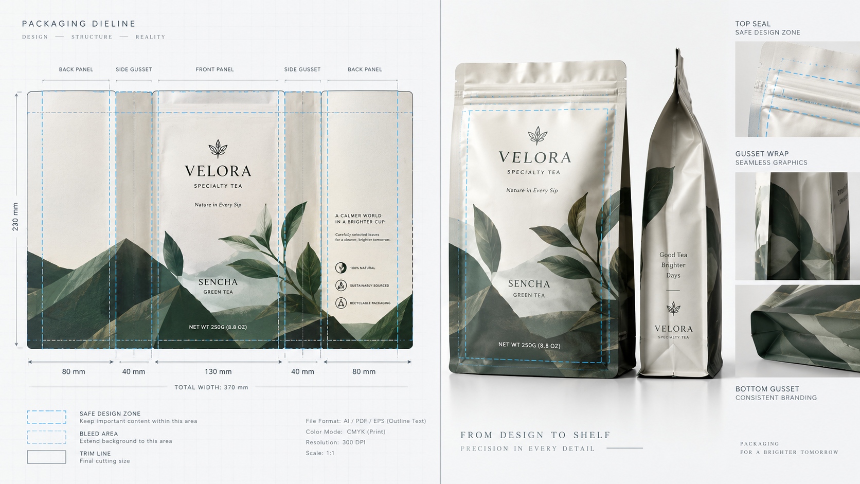
5. Actual Pouch shape Design. Put key information on panels that will show up upon filling. Leave it without seals, zippers, gussets, tear lines and curves. Look at the shaped pouch as opposed to a flat layout. A design might work on a presentation deck and not on the shelf when the bottom is enlarged, the side gusset is opened or the top is taken off. The last object is the design surface.
Principles 6-7: guard Information Hierarchy.
6. Store Critical Copy out of Production Areas. Design margins in area of seals, folds, notches, and variable-codes. Do not install small legal copy at the end of the curve of the pouch, or a place where a zipper backing turns the face.
7. Use Front and Back as a Reading System.
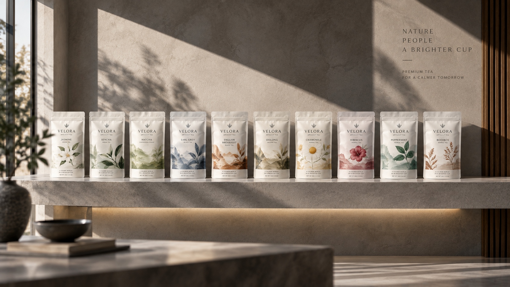
The push is made on the front, the explanation on the back. Apply attendant typography and spacing in a manner that brewing instructions, provenience, background, details of disposal and the copy that is necessary and optional all feel part of a single system rather than as holdover.
| Reading layer | Typical content | Design test |
|---|---|---|
| First glance | Brand and product name. | Reads comfortably at normal shelf distance. |
| Short evaluation | Variable, advantage and version. | Known without turning the pouch repeatedly. |
| Detailed reading | Origin, preparation and brand story. | Proper distance between elements and telling headings. |
| Required information | Net quantity, market or ingredients copy. | Readable, correct and located within stipulated areas. |
Principles 8-9: Use Colour and Typography as a System.
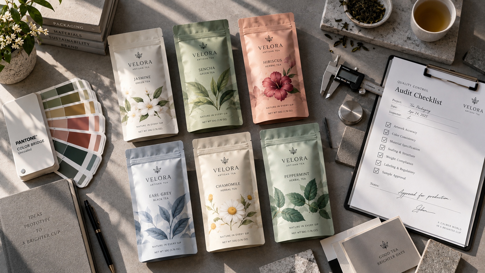
8. Use Colour to Organize the Range Give colour an equivalent function: tea family, flavour, intensity, origin or edition. Do not have the same colour imply different things on different SKUs.
9. Select Typography to Real Reading Conditions. Type size, weight, contrast and line length on the end material. Fine small type can be reformed; low contrast lettering might vanish on kraft papers or matte surfaces; narrow panels may make fussy wraps. Make a full size mock up and look at it at a distance and angle a shopper will look at it.
Principle 10: Give Every Finish a Job
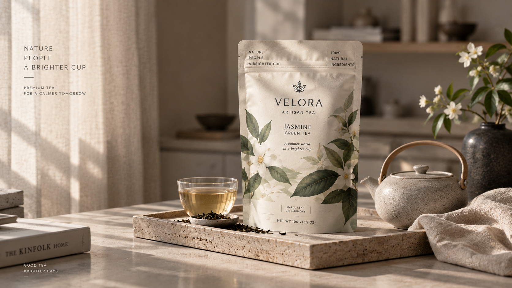
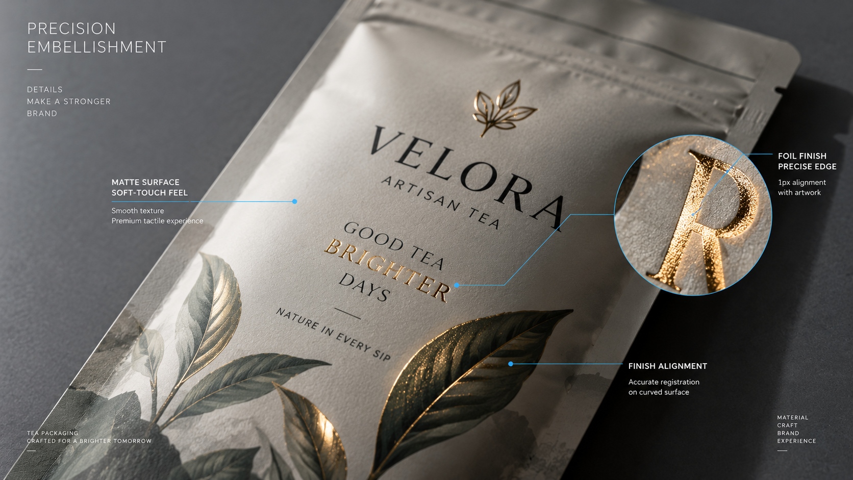
A distinct message should be reinforced with foil, embossing, tactile varnish, sheets, clear windows and metallic effects. Direct attention using a premium accent and not to gild all the elements. There are several effects that may contend, and they complicate registration and make a good layout less clear.
Label the aspect that the finish should focus on.
Check on the effect on intended substrate and colour.
Check mismatch tolerance: Tolerance around fine art. It is important to confirm the behavior of the surface by forming and handling. Determine the impact of the finish on the planned recovery path.
Principle 11: Design the System Before the Second SKU
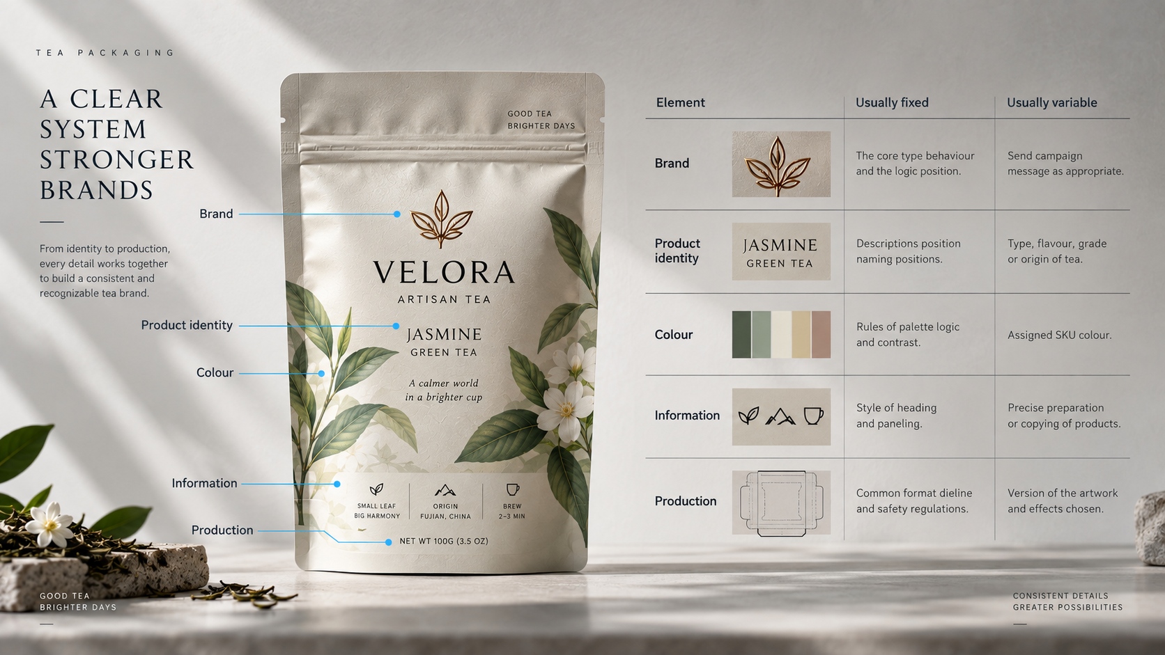
Here, set up rules of fixed and variable elements and then expand the range. Adjust the brand block, information space, typographic functions and general production limitations. Permit product names, colour hints, images and chosen narratives to evolve. Each SKU must be identifiable using a system which will not make the shelf look like unrelated designs.
| Element | Usually fixed | Usually variable |
|---|---|---|
| Brand | The core type behaviour and the logic position. | Send campaign message as appropriate. |
| Product identity | Descriptions position/naming positions. | Type, flavour, grade or origin of tea. |
| Colour | Rules of palette logic and contrast. | Assigned SKU colour |
| Information | Style of heading and paneling. | Precise preparation or copying of products. |
| Production | Common format dieline and safety regulations. | Version of the artwork and effects chosen. |
Principle 12: Approve the Printed Pack in Its Selling Environment
Check pouch that is full as well as sealed and positioned next to neighbouring SKUs. Check front-panel hierarchy, colour under retail light, under reflections, under finish registration, under standing behaviour, under side visibility and back-panel readability. Then handle the pouch as a customer would.
Design review must involve the packaging, marketing, regulatory and the operations stakeholders. They have different questions, and a brand intent should be balanced with the truth about a product and manufacturing reality in the end.
Conduct a Tea Packaging Design Audit Pre-release.
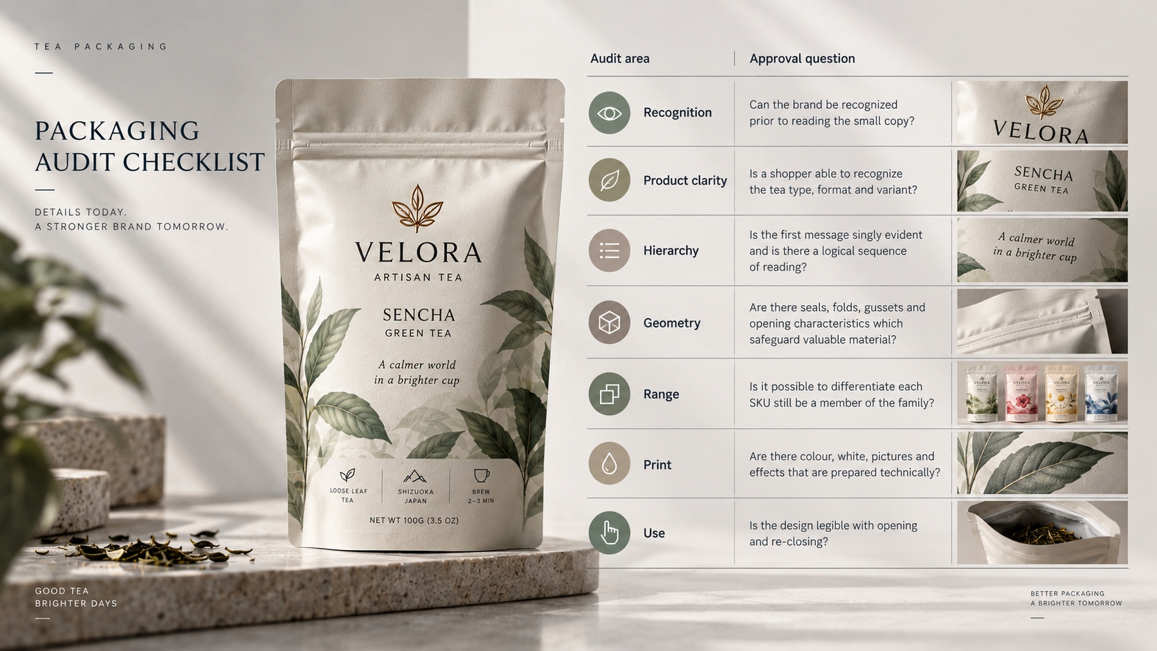
| Audit area | Approval question |
|---|---|
| Recognition | Can the brand be recognized prior to reading the small copy? |
| Product clarity | Is a shopper able to recognize the tea type, format and variant? |
| Hierarchy | Is the first message singly evident and is there a logical sequence of reading? |
| Geometry | Are there seals, folds, gussets and opening characteristics which safeguard valuable material? |
Shelf impact must also pass accessibility check. You should not use colour to differentiate products only, use clear names, pattern or any other symbols. Ensure good contrast between text and background particularly on kraft, metallic or photographic surfaces. They should be instructed in a readable order and simple language that is suitable to the market. These options enhance usability without compromising the brand concept.
A second environment of design is the ecommerce thumbnail. A pouch that displays better at full shelf size, can lose its product description when scaled down on a marketplace page. Test the front panel using the regular thumbnail sizes with the physical pack being the main authority. Do not make text received online appear bigger than it really looks.
Optimize the pack approved photography on a regular basis to launch assets. Preserve colour, finish and proportions of the physical sample and avoid retouching to remove natural kraft variation or produce the same metallic effects not available in the printed pouch. The packaging promise should be reinforced through digital presentation and not rewritten.
Tea Packaging Design Questions
Are all tea SKUs to be of different colour?
Not necessarily. The system can also utilize names, illustrations, patterns or organized labels.
What is the number of finishes that a tea pouch must have?
Only those that have a definite visual or tactile use and can be produced reliably should be used.
When is the dieline supposed to come into the design process?
Before final artwork. The exploration of concepts can happen sooner, however, panel geometry and production zones need to regulate the emitted file.
What should be the approving of a design?
Check full-size artwork, applicable proofs, a prepared and stuffed pouch, entire SKU line and the target selling environment.
Post time: Sep-20-2026


