


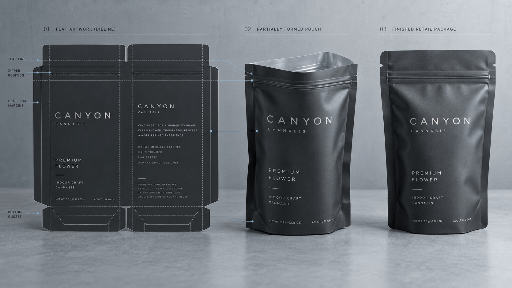
Weed bag has a couple of seconds to present itself. An adult consumer can recognize the brand and product line, variety and pack size without search in the means of graphic design. Meanwhile, there should be secured space in terms of warning, symbols and other controlled information. The power to affect the shelf is not an issue of making everything louder but having clear decisions.
The 12 principles of the weed bag designs proceed according to the actual experience of being seen at a distance, differentiated among the competitors, matched with adjacent SKUs, taken and re-used upon being opened. Finally art will still be checked against the existing regulations in all target markets.
The Five-Second Shelf Test.
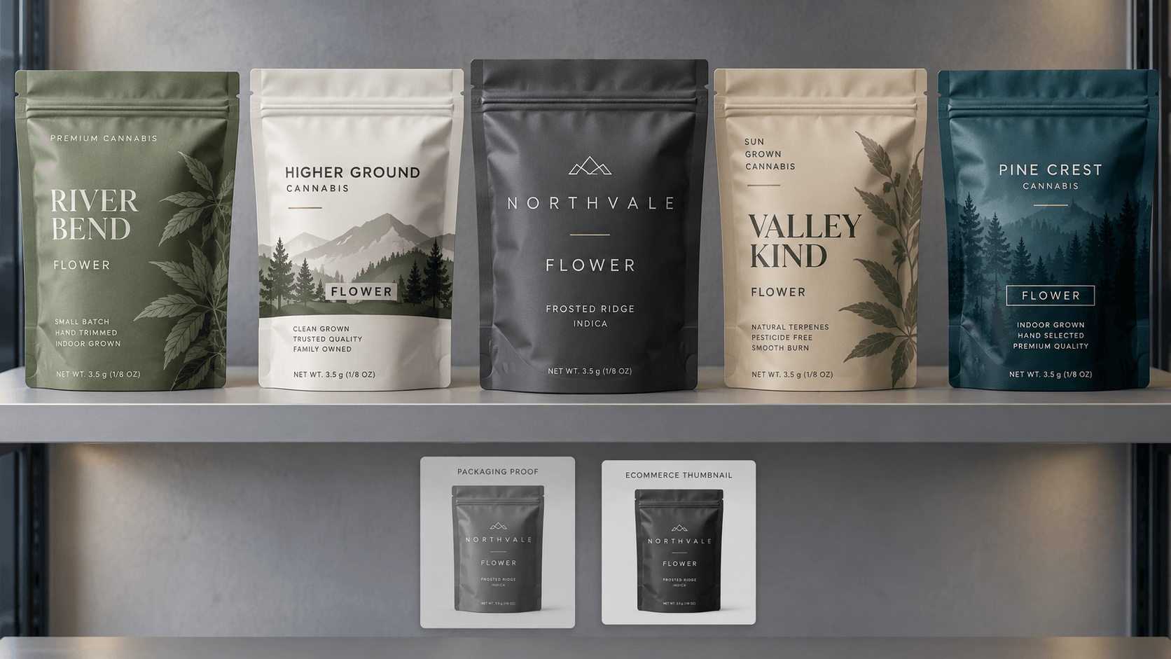
Print the front panel full size and put it into a stack of rival packs. Look at the group at a normal distance of shopping as though you were shopping at that distance and then turn. Do you remember what brand? What is flower, pre-rolls or other form of product? Was there an attribute that made you differentiate the SKU? When this answer is no, then the design is likely to be non-hierarchical.
Do the test again in a grayscale, only a thumbnail size and with a bright overhead light source. Grayscale shows that color is going to the whole navigation system. Thumbnail is a simulated listing on the internet. Glare on glossy finishes or metallic finishes is revealed by harsh light. This easy test assesses the package, not the presentation slide of the designer.
Principles 1–3: Recognition Within Your One Year.
Create a strong Lead Product Indication.
Select one recognition type: a wordmark, typographic structure, shape or trained visual motif. Fix it at a constant level. When all the logo, the illustration, the metallic effect and the product name are put in a racing competition to give first prize, then none of it comes to memory.
Product Format- Make it work.
Premium, reserve and crafted do not inform a buyer of what is inside. List the type of product with the appropriate terms that are accepted in the market. Even a quick or reduced bag ecommerce avenue should not hide product identity.
Create Adult-Oriented Appeal
Communicate through quality with the use of material, typography, composition and subdued imagery. Do not copy candy, cereal or toy packages. Juvenile fonts, characters, novelty shape and well-known snack trade dress may add it to the youth-appeal risk. Look at the overall impression and not an age statement and fix otherwise child-oriented design.
Principles 4–6: Prepare the Front Panel.
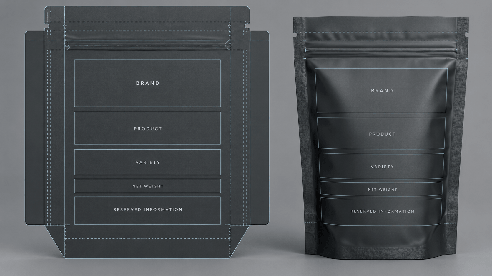
Establish an Intended Reading Sequence.
A good order would be brand, product form, variety, quantity and controlled identification. The sequence which one wants to take is determined by the market, however, it ought to be purposeful. Withdraw the lesser claims until the eye moves as one runs along the line of choice.
Defend Compliance Areas Ahead of Time.
Reservation spaces of the necessary symbols, warning signs, initial net quantity and variable space at the first dieline. Keep them out of zippers, seals, tear notches, gussets folds and glare. The jurisdictions might need to have separate versions of artwork, thus the template must be flexible enough to accommodate a longer warning or alternative market.
These actions can be performed either individually or at the same time as others.
Other buying decisions are offered by strain, flavor, product family and quantity. Do not confuse a big 3.5 to seem to be strength or a colour band to be ambiguous and be both a variety and a weight. Assign all fields of navigation a role and a place.
Principles 7-9: Enhance Shelf Navigation.
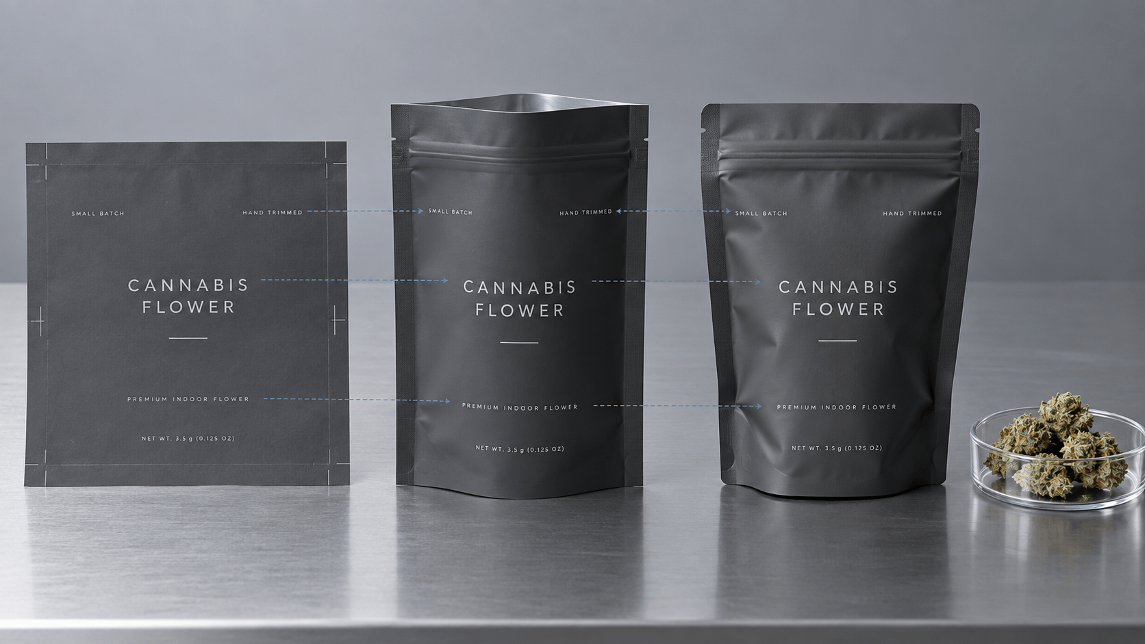
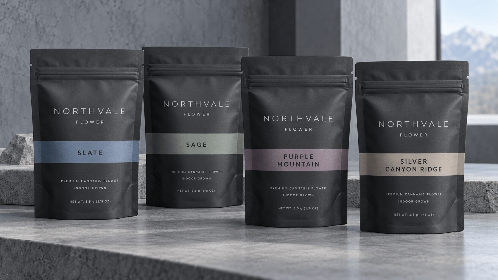
Use Color as a System
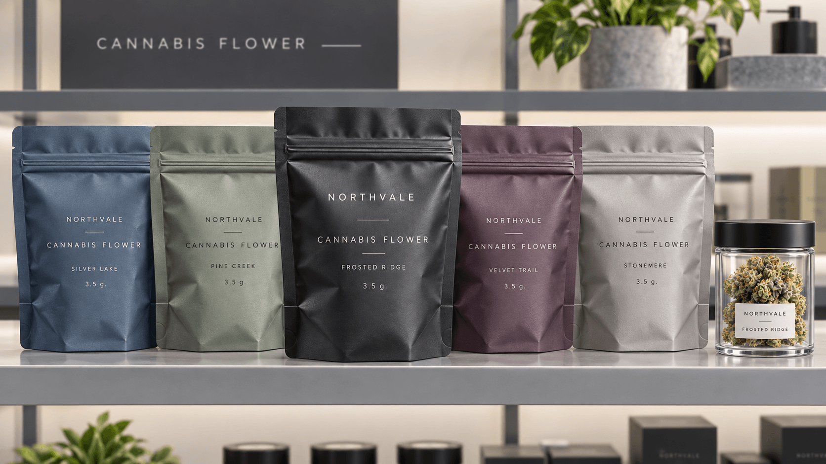
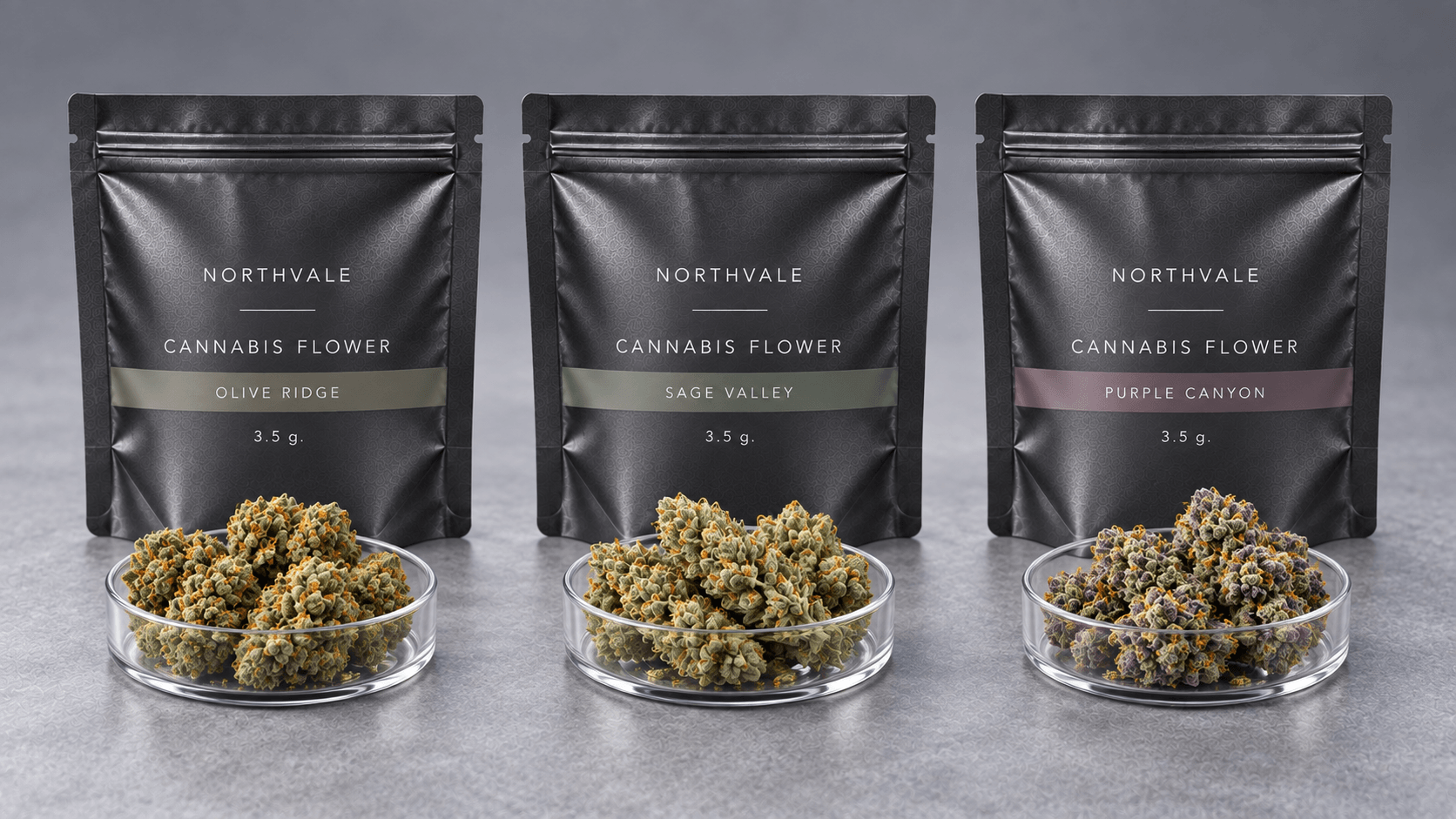
Develop a definition of color prior to giving the shades. A single layer could be a product format recognition cue and another, smaller cue could be a variety recognition cue. Adjust contrast of the required text. Without a color logic in the portfolio, the portfolio is becoming harder and harder to run due to the introduction of new SKUs.
Develop 1:1 SKUs.
Maintain brand cues constant and alter a manipulated system of product cues. Test the shortest and longest names of the template. They should be accommodated in a good system without reducing the type to a tiny size or sacrificing necessary content.
Design Real Dispensary Environment.
Packages can be displayed behind glass or under bright LED lamps or within the exposition of crowded displays. The glare can be decreased on a matte surface, however, very low contrast printing may disappear. Only quieter areas can attract attention to create the metallic and holographic effects. Justify an actual sample under representativeness light.
Principles 10-12: Design It to last Beyond the First Sale.
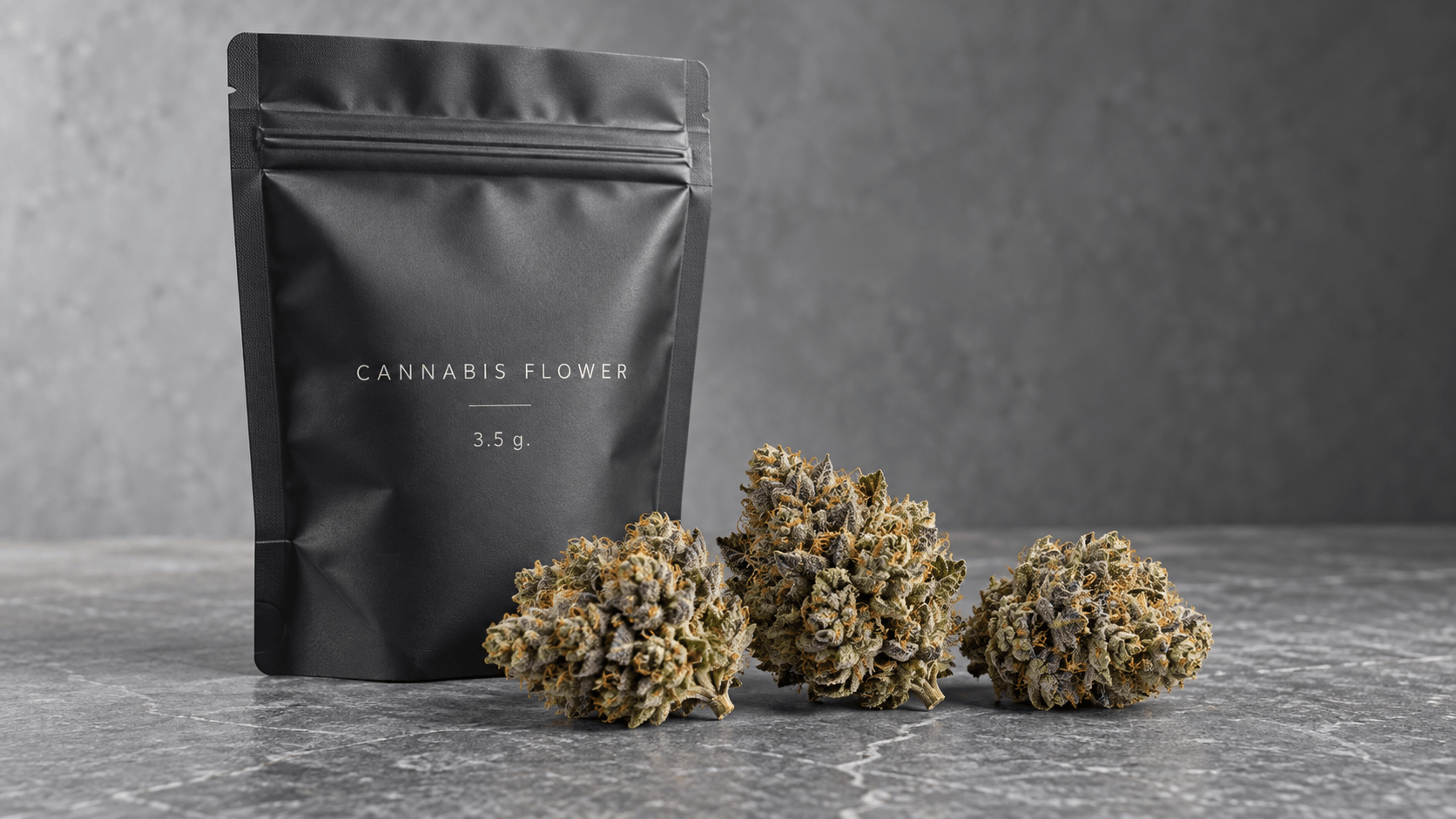
Take Identity Off Opening.
Do not put the whole brand, or vital product identity, on a tear header. Once it has been opened the retained pouch ought to remain recognizable and contain the information required by the consumer. How do the front folds when the product level is decreasing.
Find Graphics to Bag Made.
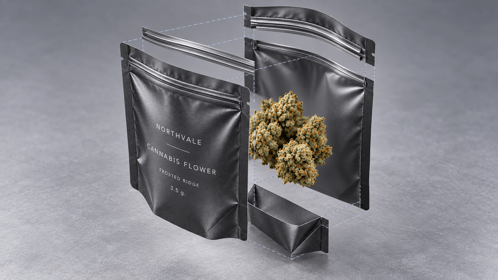
A stand-up pouch is not a poster, which is not flat. Filling is used to stretch the bottom gusset, alter the front-panel angle and curve artwork along the edges. Construct a physical prototype, fill to the target volume and examine the actual shelf face.
Construct an Expansion System of the Artwork.
Assets of separate stable brands, SKU data, content that varies by jurisdiction, and batch data. Make use of managed file names and approvals. This makes the brand able to add formats or markets without remaking all the pouches or unintentionally introducing a out of date warning into the manufacturing process.
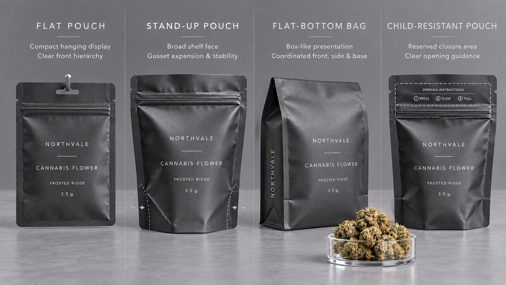
The Change in the design of Weed Bags, brought about by Bag Formats.
|
Bag Format |
Shelf Behavior |
Design Priority |
|
Flat pouch |
Small, and can be stored easily in bins or hanging facilities. |
Strong front hierarchy within a limited area |
|
Stand-up pouch |
Gifts a broader shelf face when properly filled. |
Balance and stability, gusset expansion, and front-panel stability. |
|
Flat-bottom bag |
This makes a box-like top-quality presentation. |
Co-ordinated front, side and bottom-panel system. |
|
Child-resistant pouch |
The upper design area is influenced by opening feature. |
Easy guidelines and enclosed closure space. |
Conduct Competitive Shelf Audit.
Gather contemporary market illustrations at the very most with the view of comprehending the categories, however never with the view of imitating them. Note prevailing colors, frequent name of products, the shapes of bags and quantity of information competing on the front. Next discern in which category one is confused. Design opportunity can be whisper typography, less wordy, or more rigorous information-not another shouty graphic.
Check the proposed pack against the said environment. Inquire about whether it is unique and does not feel like a standard snack and whether it will remain recognizable in 3 or more SKUs.
When Weed Bags go wrong.
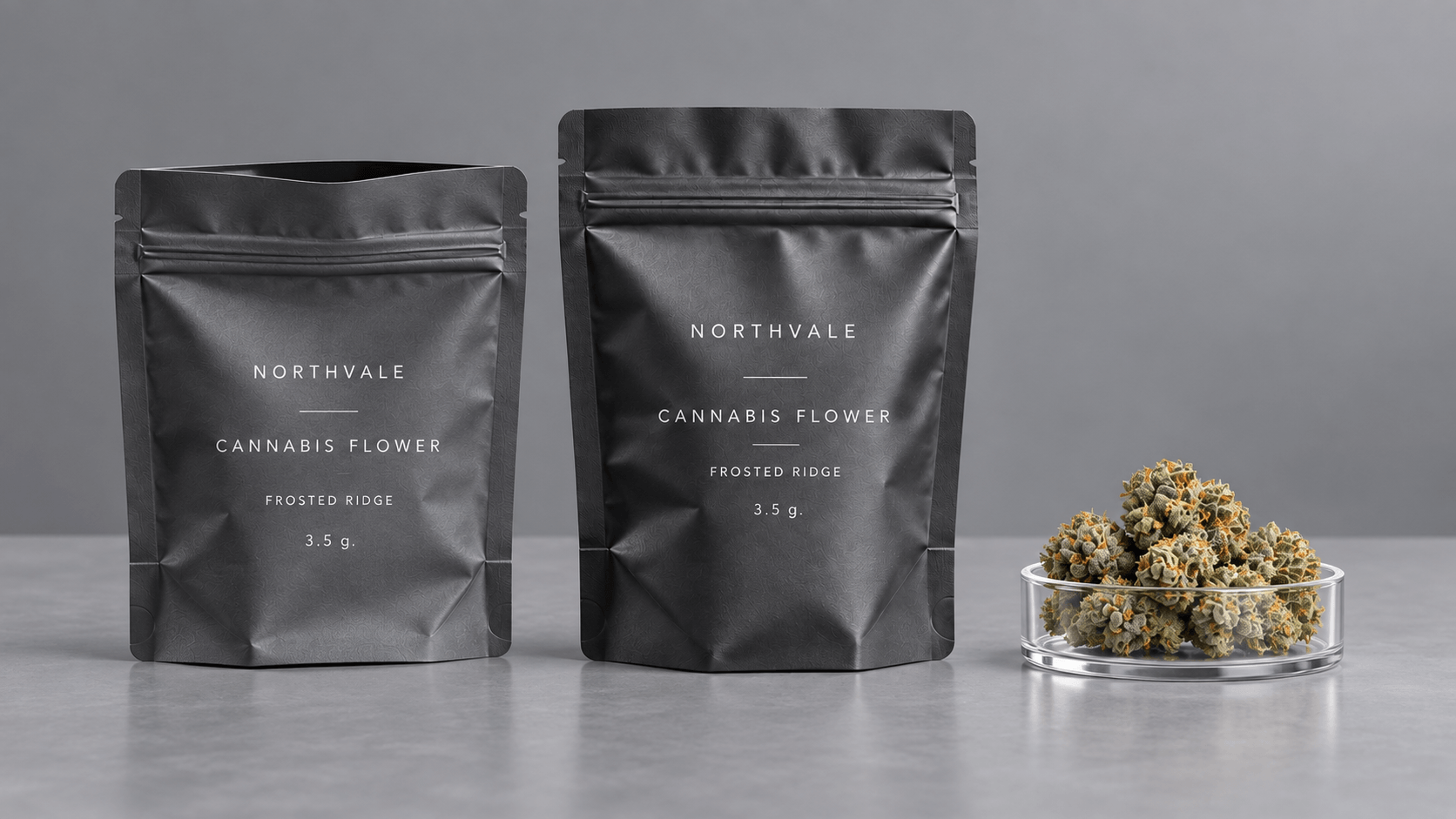
The painting is constructed upon a flat (distorted) rectangle and filled out.
Imagery of flavor takes precedence over the controlled product image.
Each SKU font, layout and finish are different.
A metal background decreases the contrast of warning or barcodes.
The weight, potency and variety are shown, with no numbers or labels.
The instruction on child resistant opening is provided as small print.
The package is passed on-screen without a printed, formed sample.
Weed Bag Design Brief Checklist
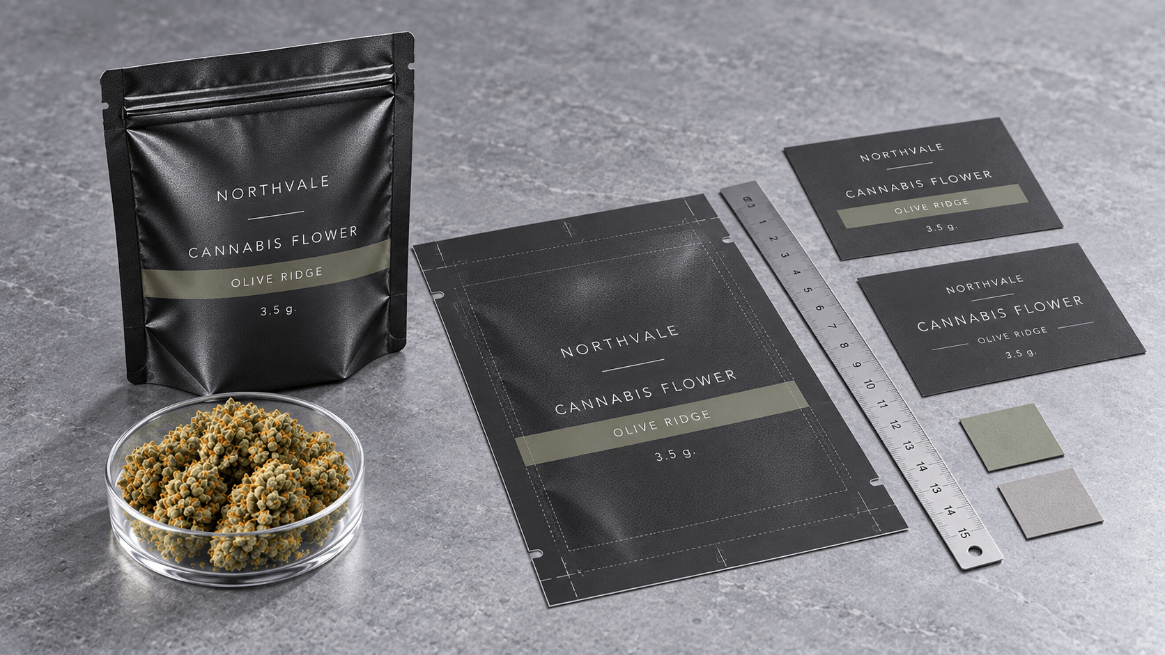
Target market and licensed sales channel
Structure of product form, variety and premeditated pack sizes.
Adult targeted consumer and preferred shelf.
Pouch format, fill volume and opening system.
Legalized brand property and forbidden visual land.
Where needed areas and variable-data technique.
Priorities of printing process, appearance and finish of materials.
SKU growth and plan of artworks-the version.
Frequently Asked Questions
Should all the bags of weed adopt varied color?
Color may also be used to aid navigation, but it must be a definite system. SKUs should still be differentiated by typography, labels and layout where there is no color or where there is poor reproduction.
Are they able to make the bag look high quality without foil?
Yes. The geometricity, type, subdued contrast, tactile quality and print uniformity can be more of a high premium statement than over decoration.
When is the dieline to be complete?
Check before locking the design the product volume, closure and compliance-space requirements. The last test is to be checked on the real made pouch.
Make a Weed Bag Shelf System that Works.
Spread your assortment of products, replenishment mandates, sampling areas and endorsed content with YPAK. We are capable of assisting in coming up with bespoke pouch design and production-ready dielines of a unified household of packaging weed.
CTA: Build Your Custom Weed Bag Design
Related page: Explore YPAK Cannabis Bags
Post time: Oct-13-2026


